I am Matthew Rudd. I design brands, drawing on my love of art and music.
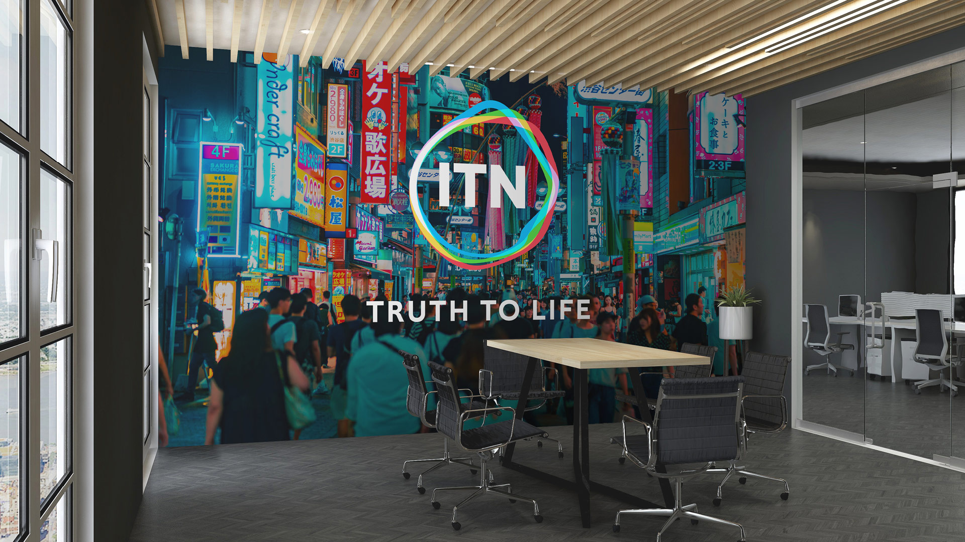
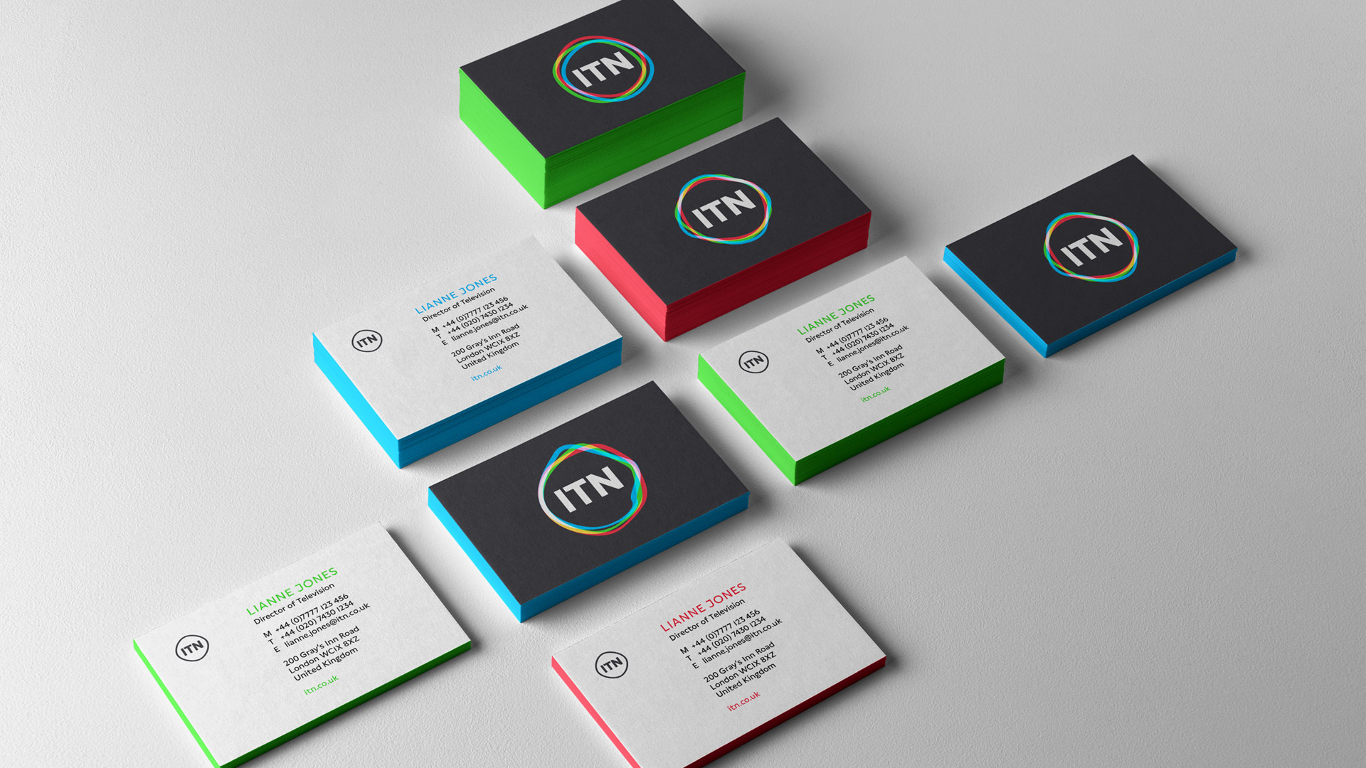
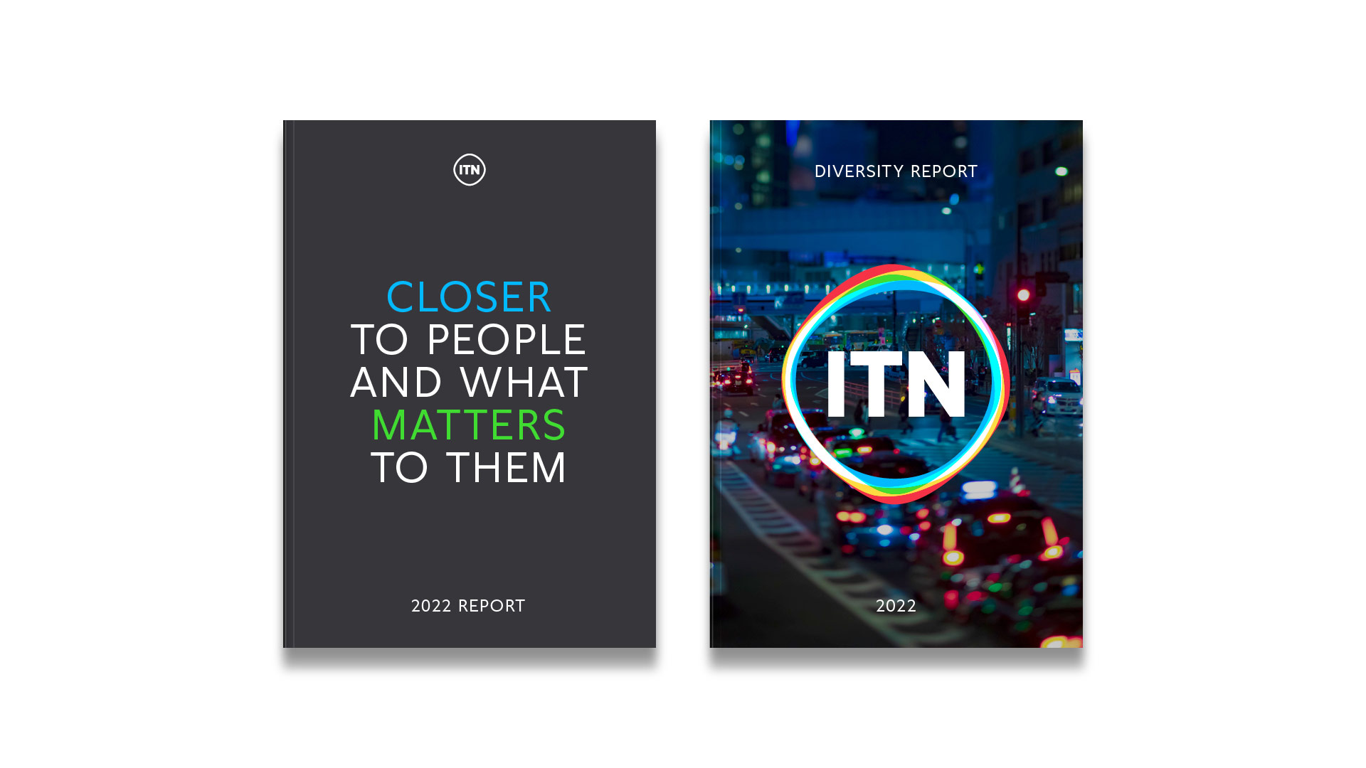
ITN Rebrand
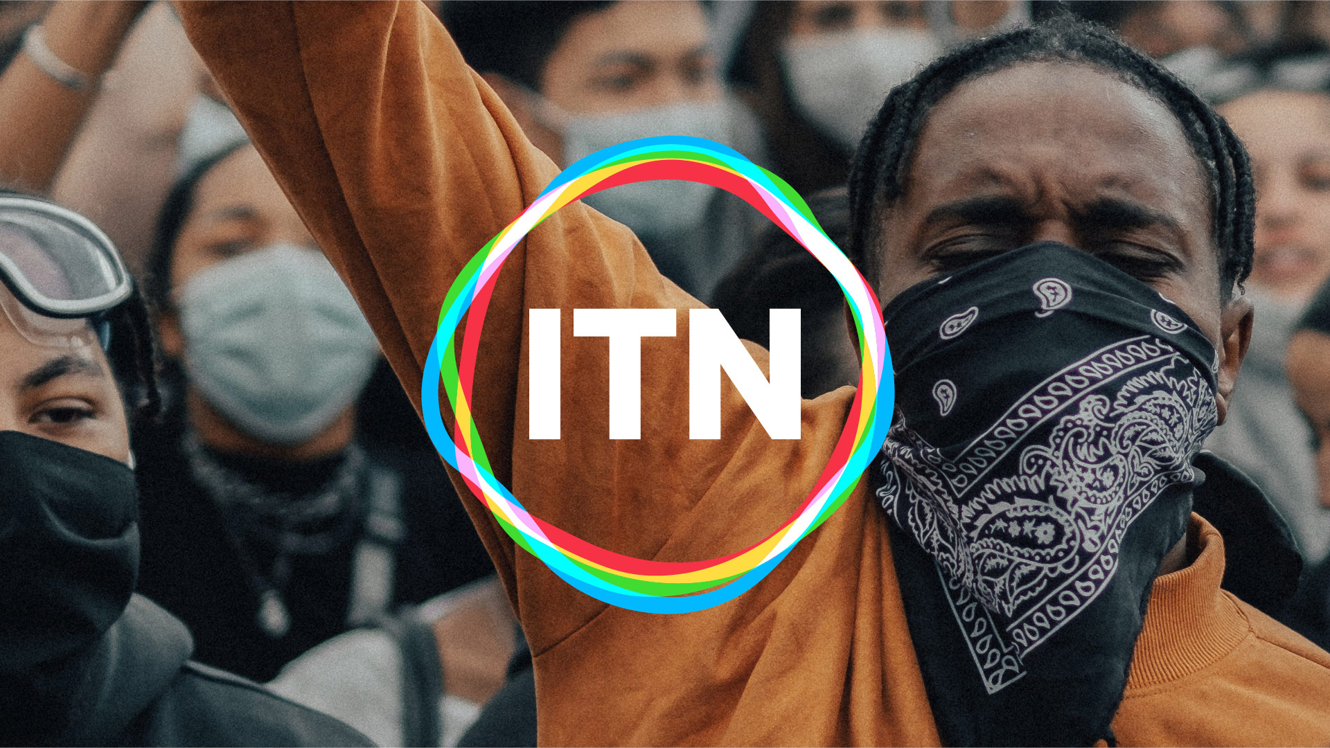
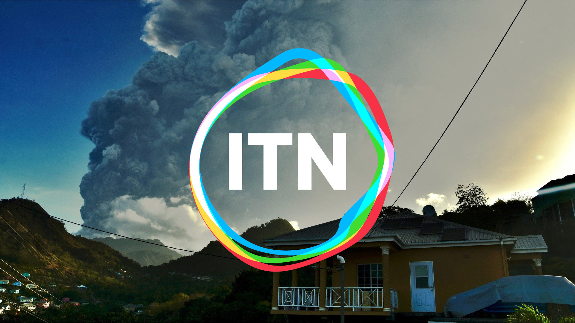
Working in partnership with Undivided, we have created a new visual identity and positioning for ITN. This is the first major rebrand for the production company since the early 2000s, and the first major change to its iconic logo since 1970.
We built the new logo around the original, simple ITN letterforms to signal a continued dedication to accuracy and impartiality. But this time we set free the rigid, angular line around the letters so that it can move and respond to stimulus like a living cell.
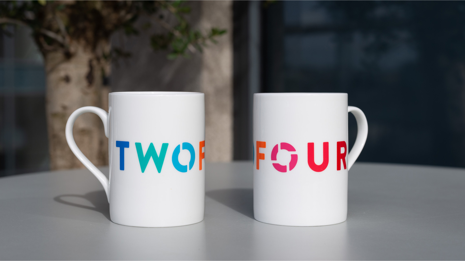
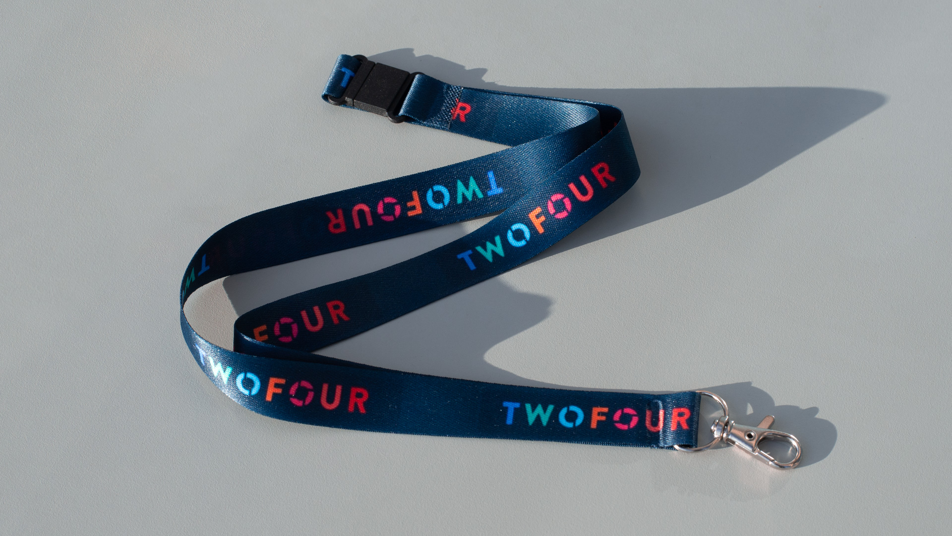
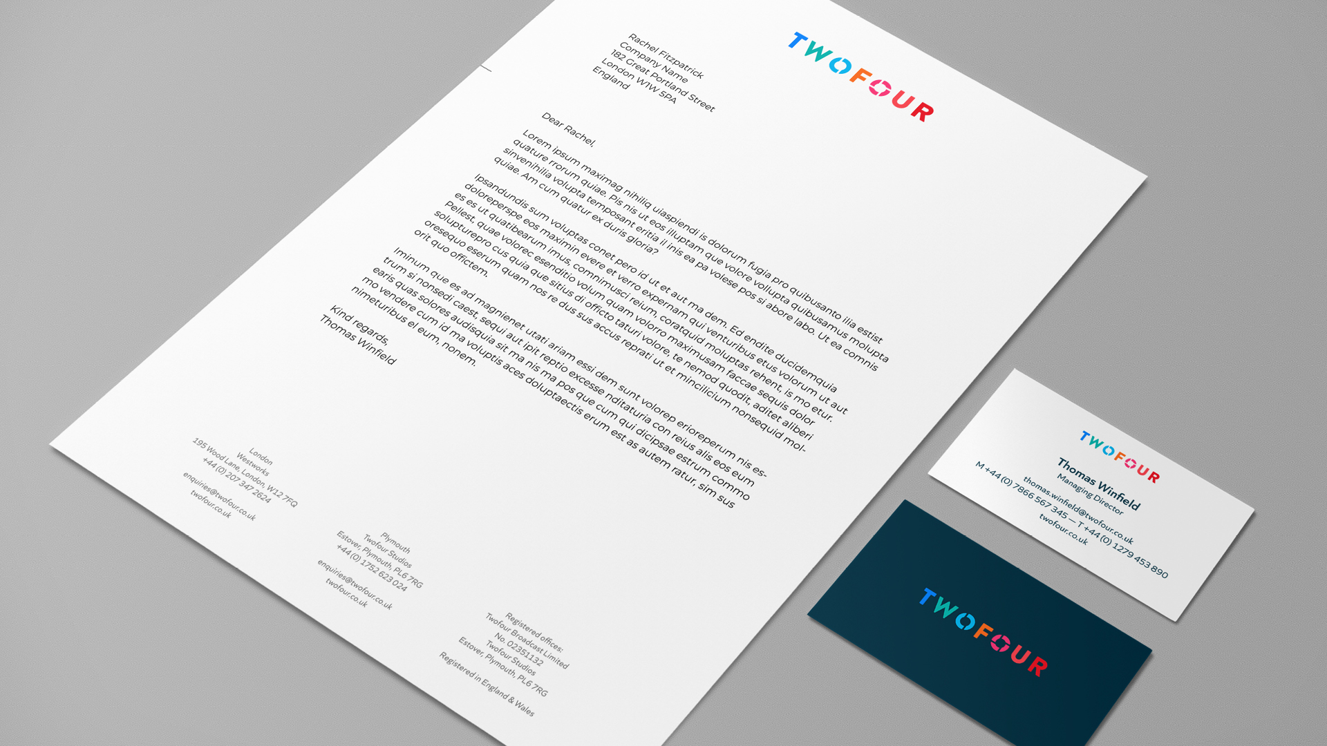
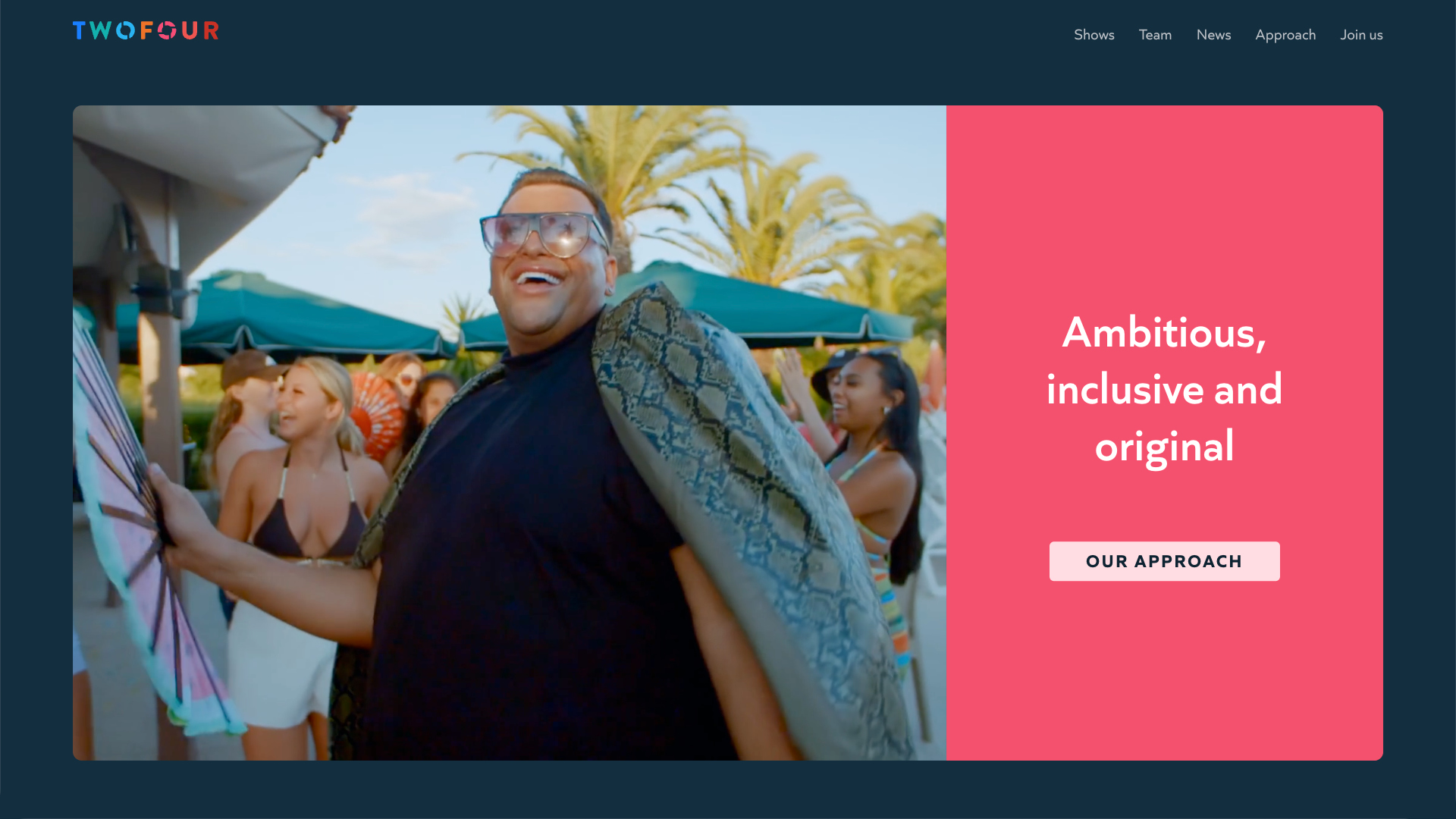
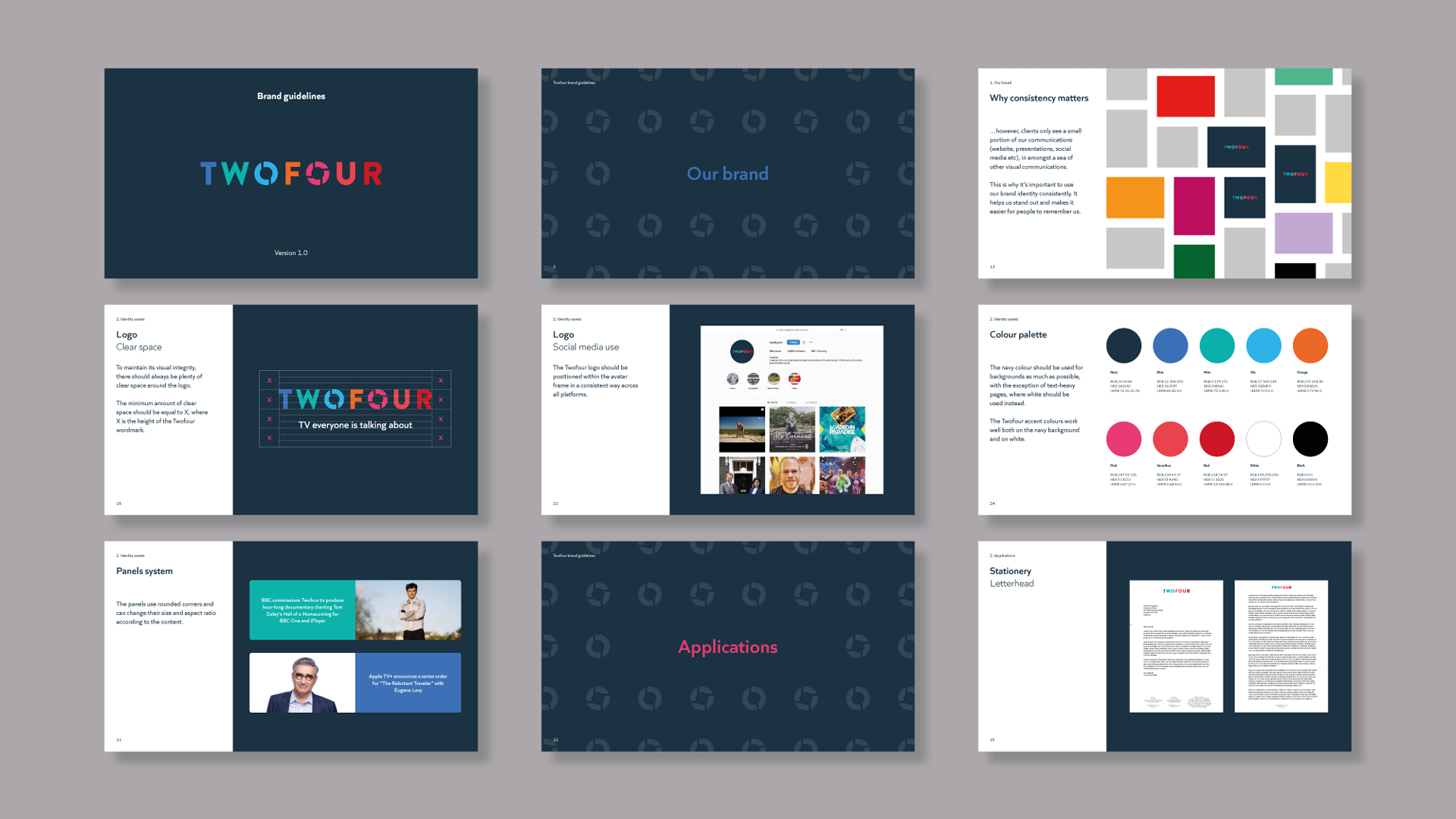
Twofour rebrand
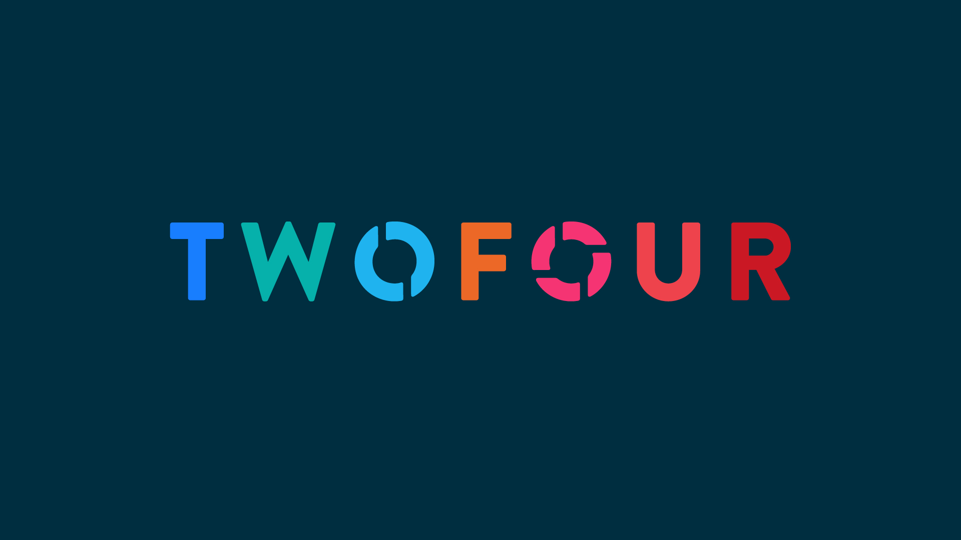
Twofour is an award-winning TV production company with offices in Devon and London. The company makes non-scripted programmes including The Reluctant Traveller, Educating… and Make Me Prime Minister.
Last year Twofour asked me to create a new visual identity for them.
My job is to help you stand out in a noisy world. Rather than follow trends, let’s make artful branding which helps people to see who you really are.
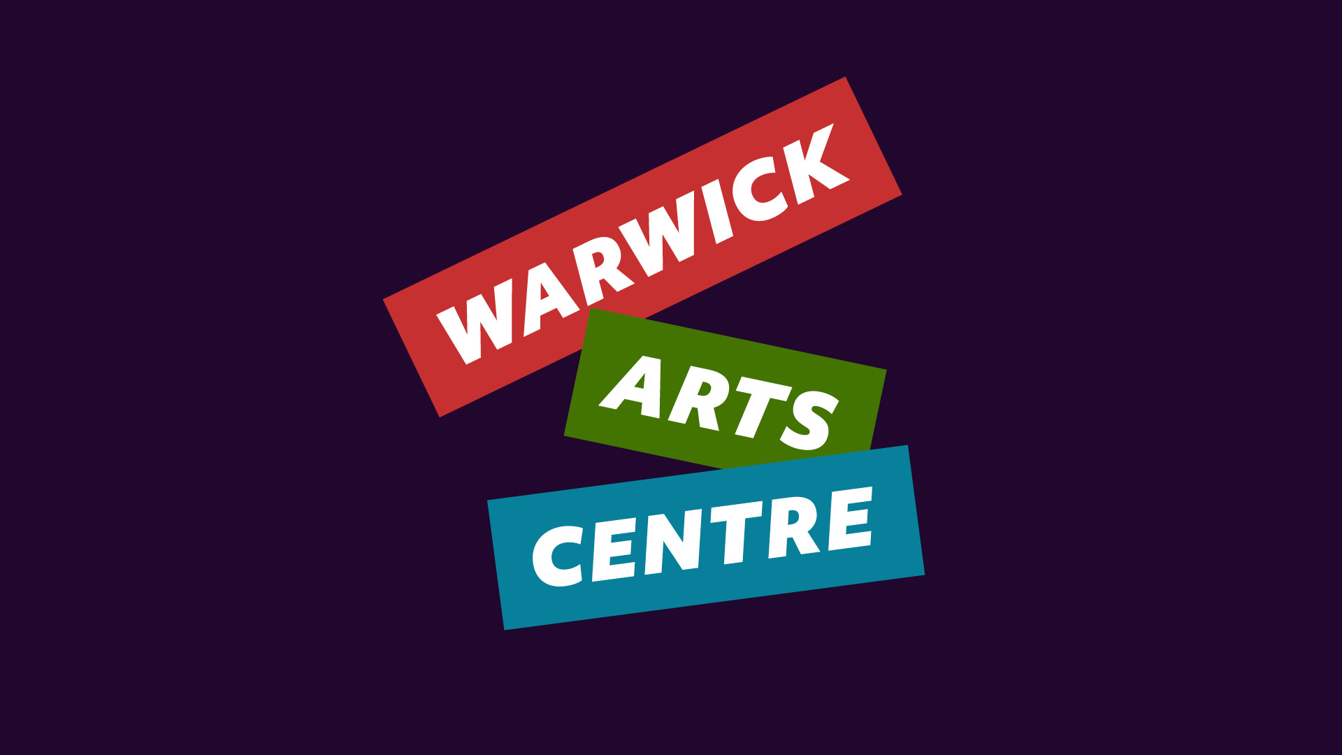
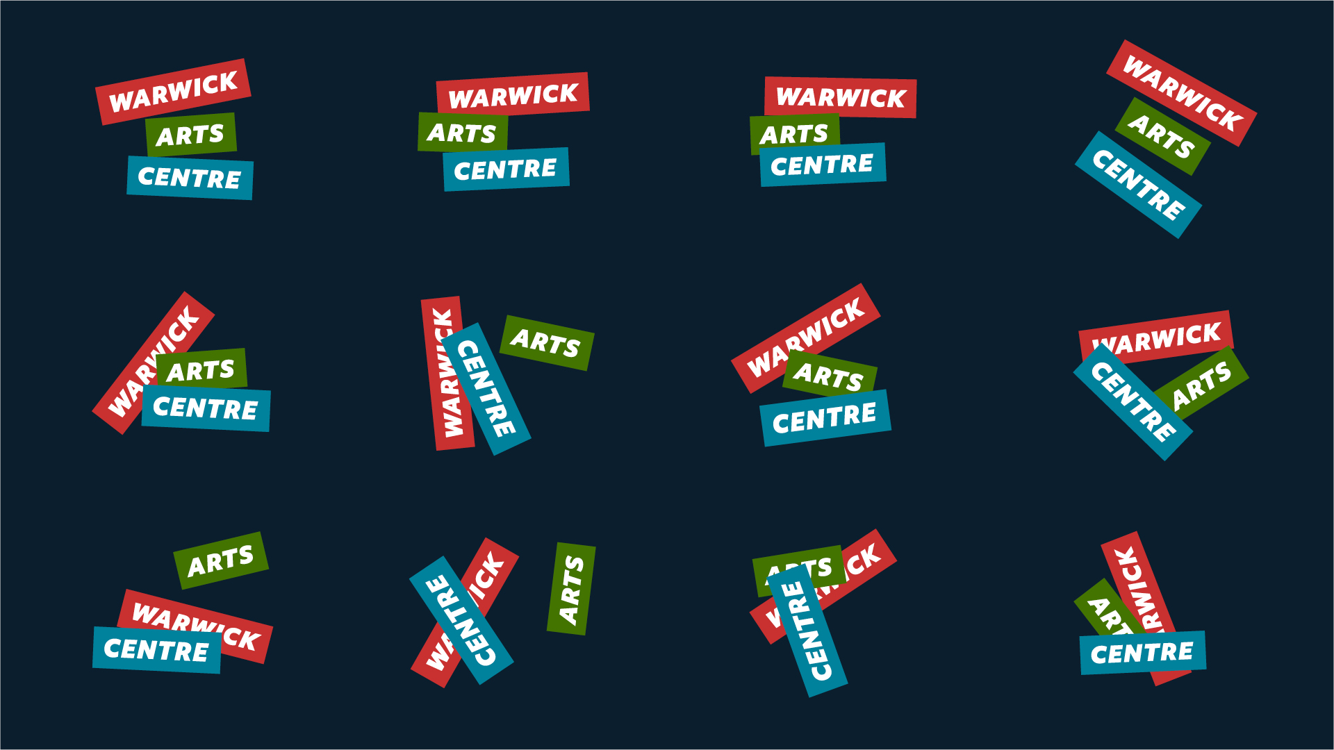
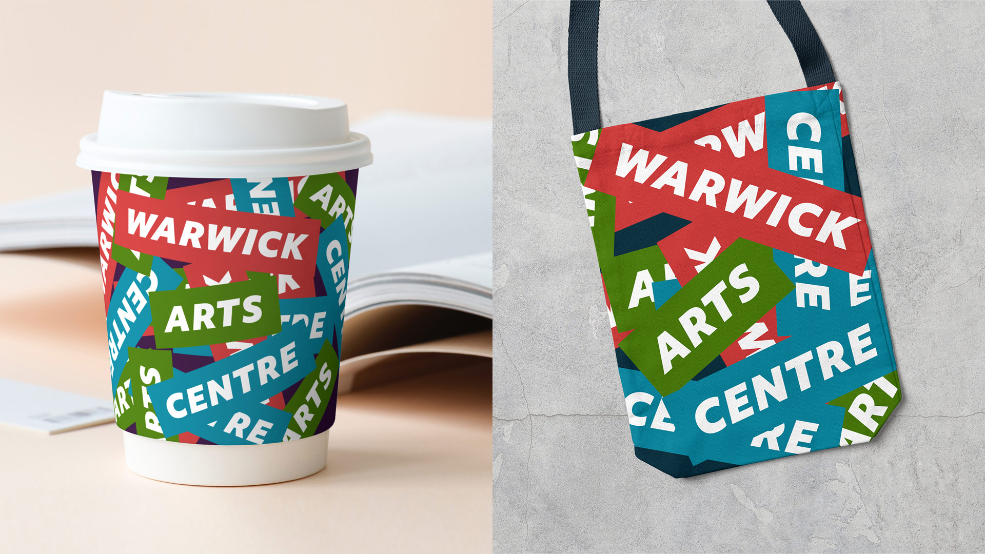
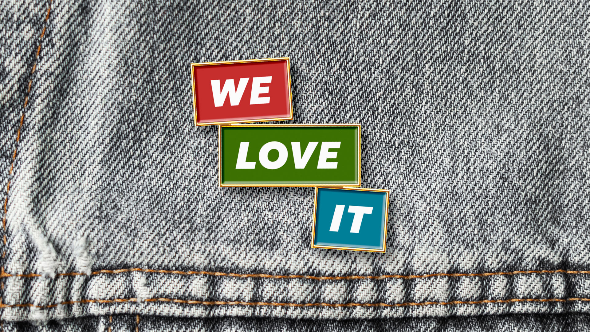
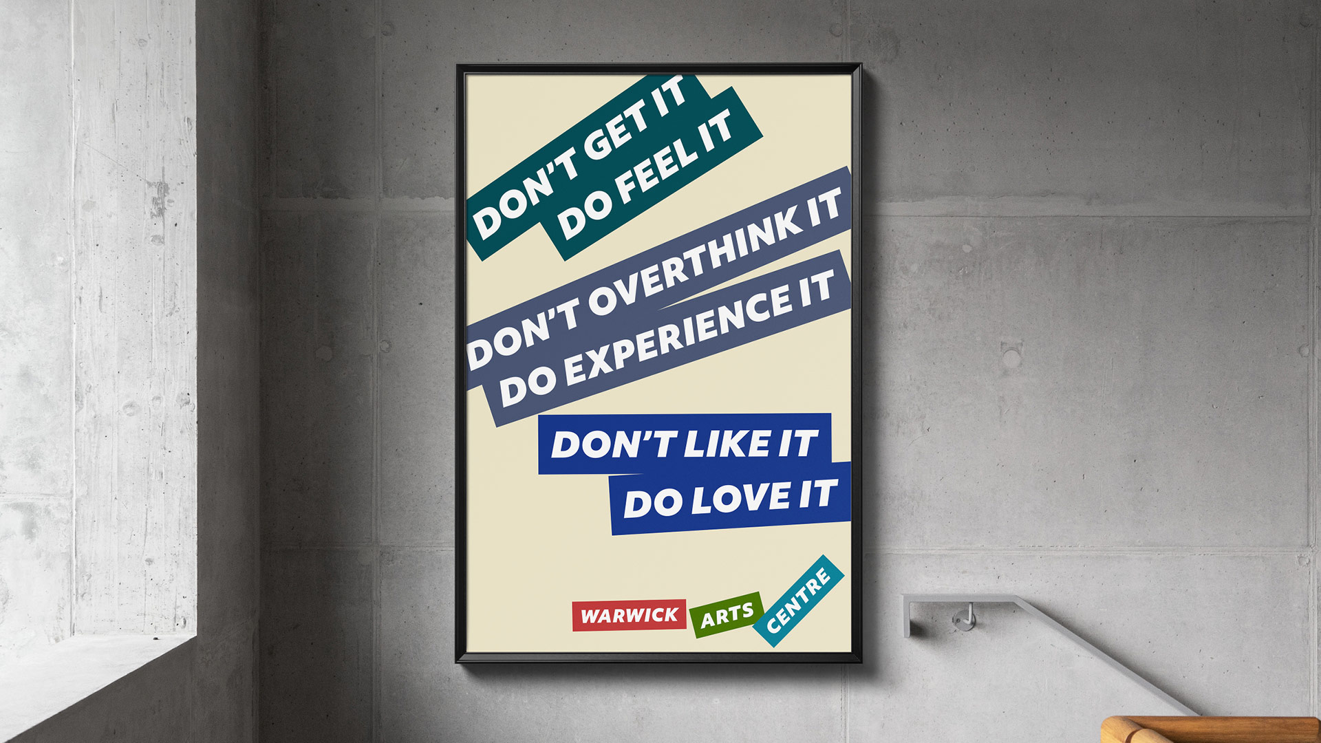
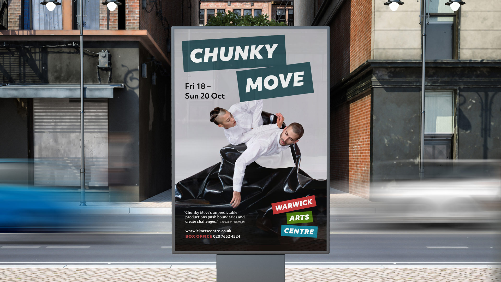
Warwick Arts Centre Rebrand
Working in partnership with Undivided, we have created a new positioning and visual identity for Warwick Arts Centre.
We designed a Bowie-inspired cut-up logo and we threw it around with other typography and pictures to create a joyful, emotional and unexpected new brand.
A good design process is rigorous, joyful and brave. Let’s make space for research, fun and uncertainty. Making original and exciting work involves a bit of stumbling through the dark.
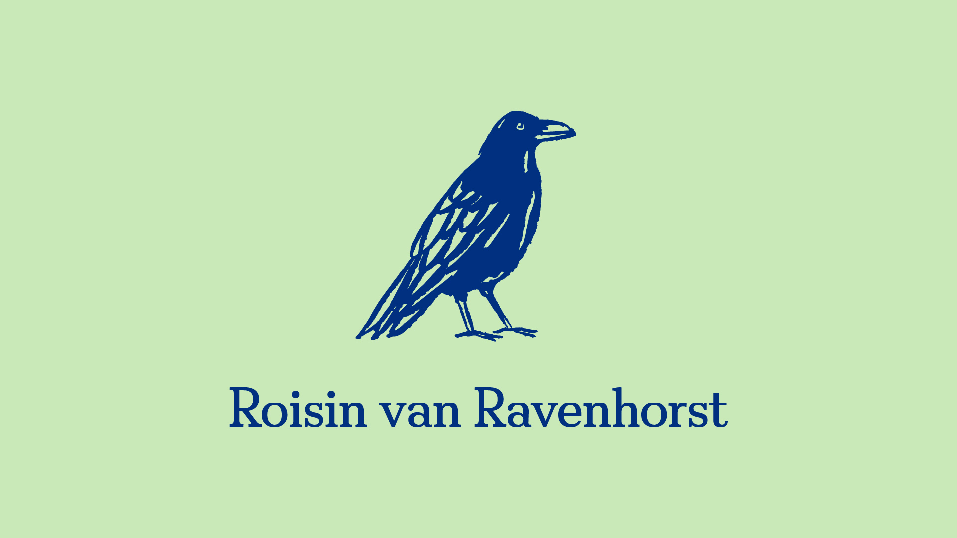
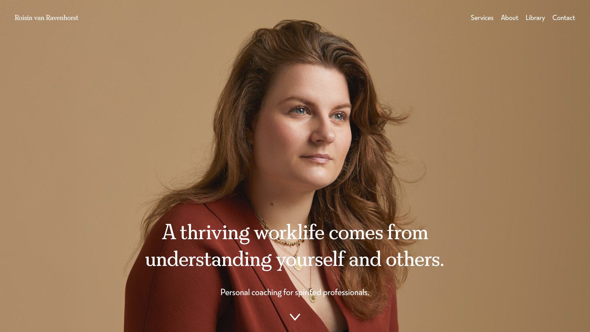
Roisin van Ravenhorst Identity
I have recently enjoyed designing a brand and a website for Roisin van Ravenhorst. Roisin is an executive coach who helps people thrive in the workplace by helping them to develop their leadership, relational intelligence and communication skills.
In general, I have designed identities for organisations rather than individuals. In this case, it was interesting to get under the skin of one person’s ideas: both their business vision and their ‘spirit’.
I think it’s good to collaborate with a spirit of openness. Let’s share our questions, doubts and excitements as we work together. This way we will get the best from each other and arrive at meaningful, engaging work.
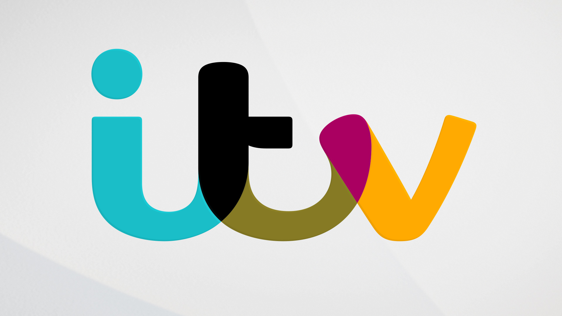
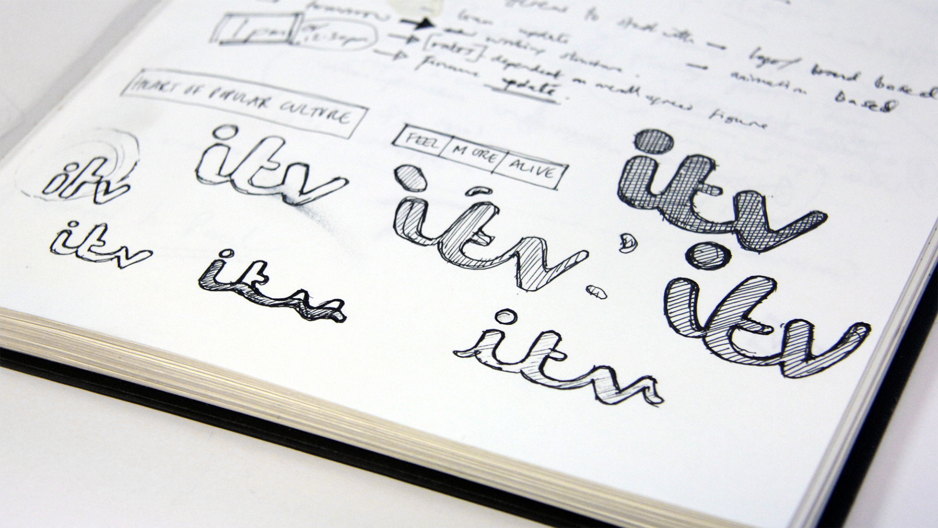
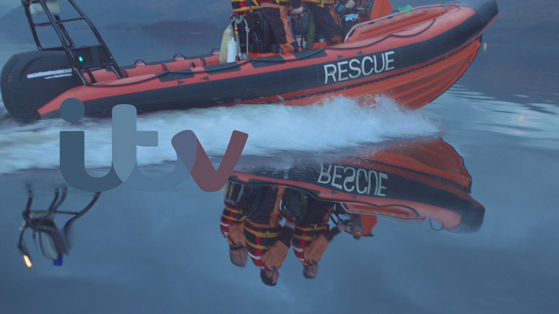
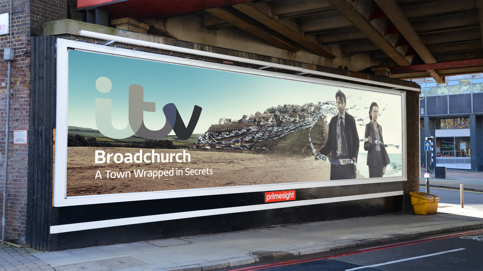
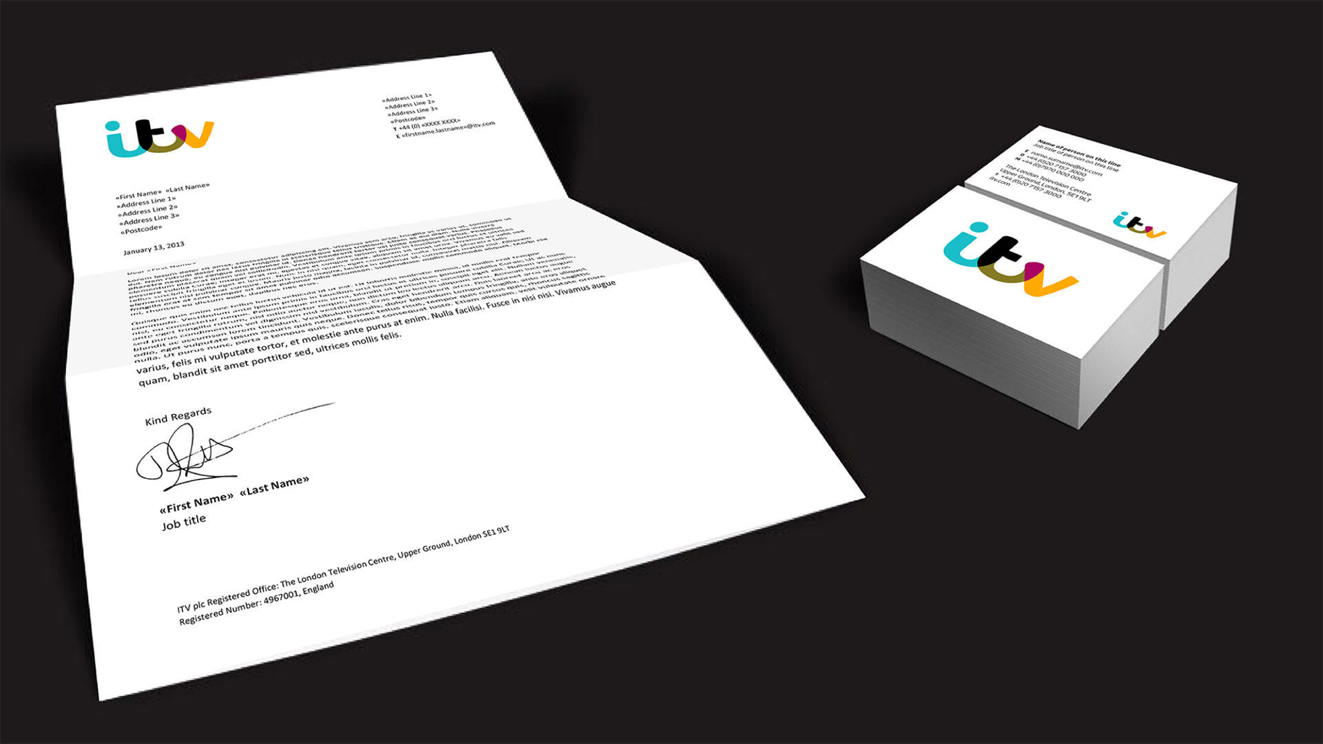
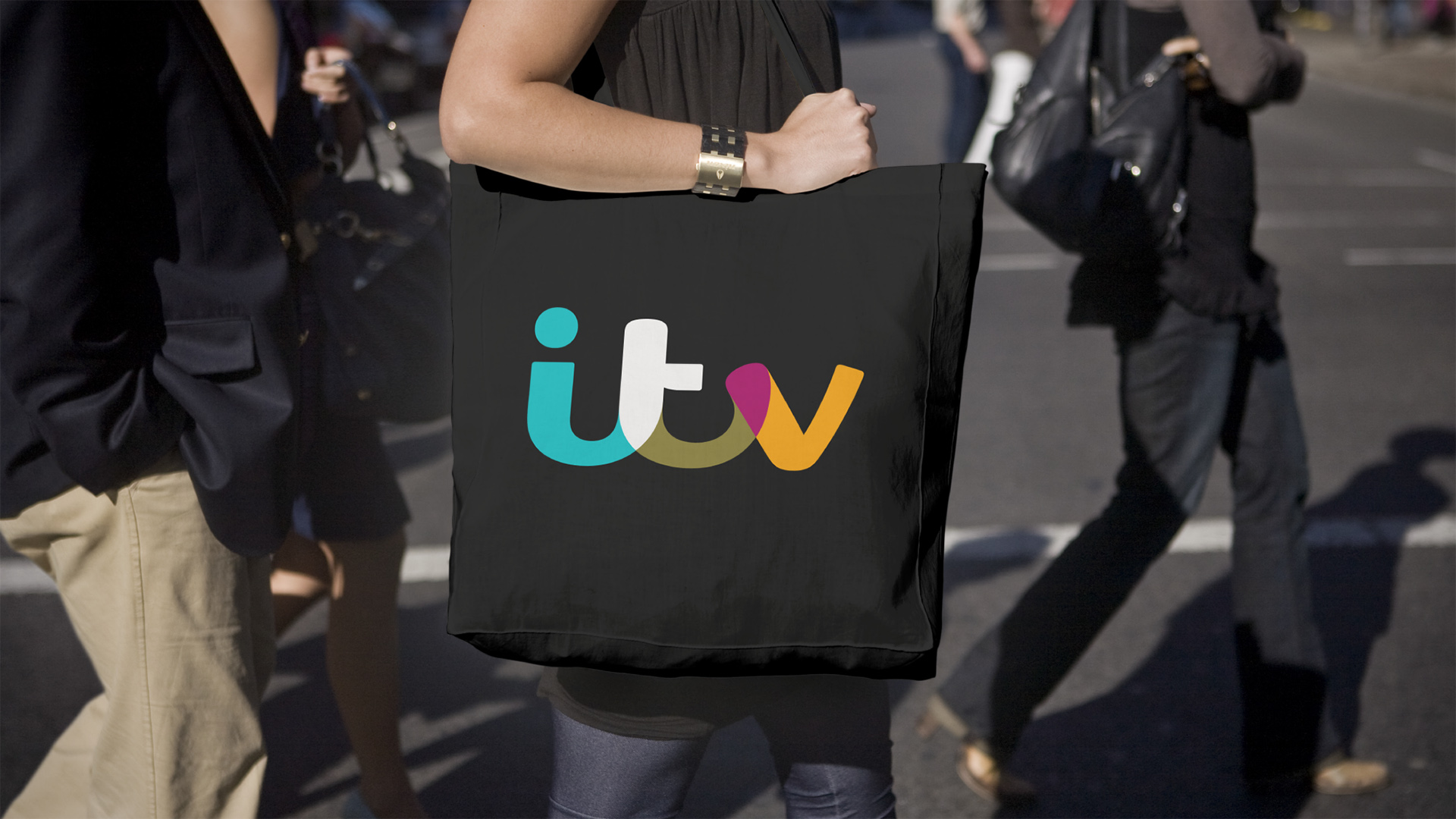
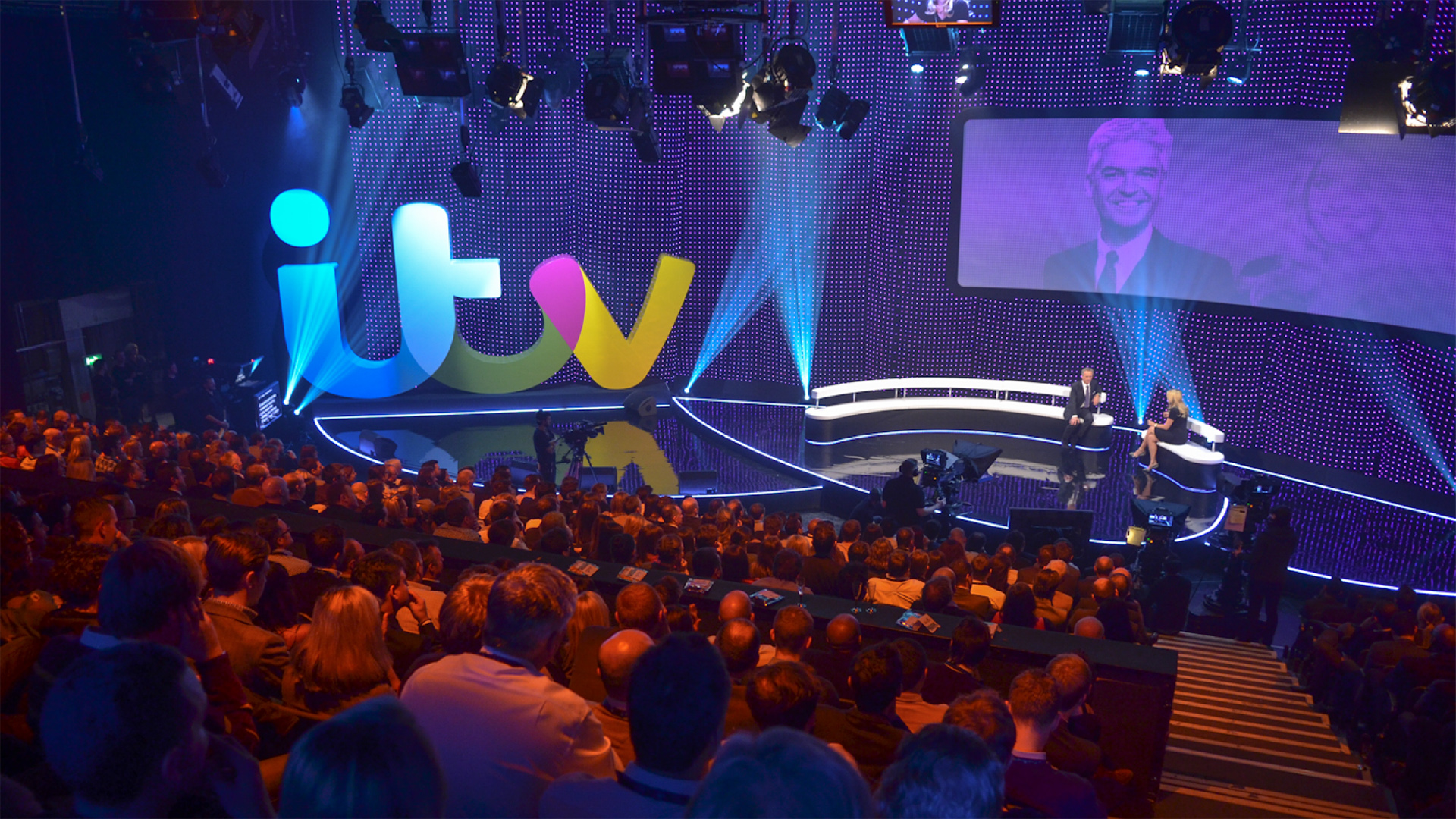
ITV Network Rebrand
When we made our new logo design ‘pick colours’ from its environment, it felt like we were helping ITV with their ambition to be seen in a new light. Making the identity colourful and dynamic made it feel more friendly and less corporate.
I led a pop-up team to develop a completely new visual identity across the network. A group of fifteen creatives was formed from myself and my collaborators, along with designers and producers from ITV’s own creative department.
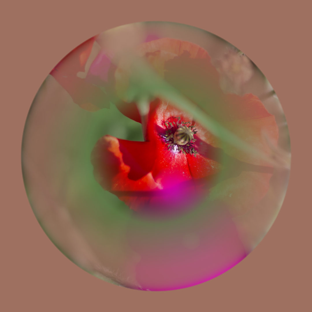
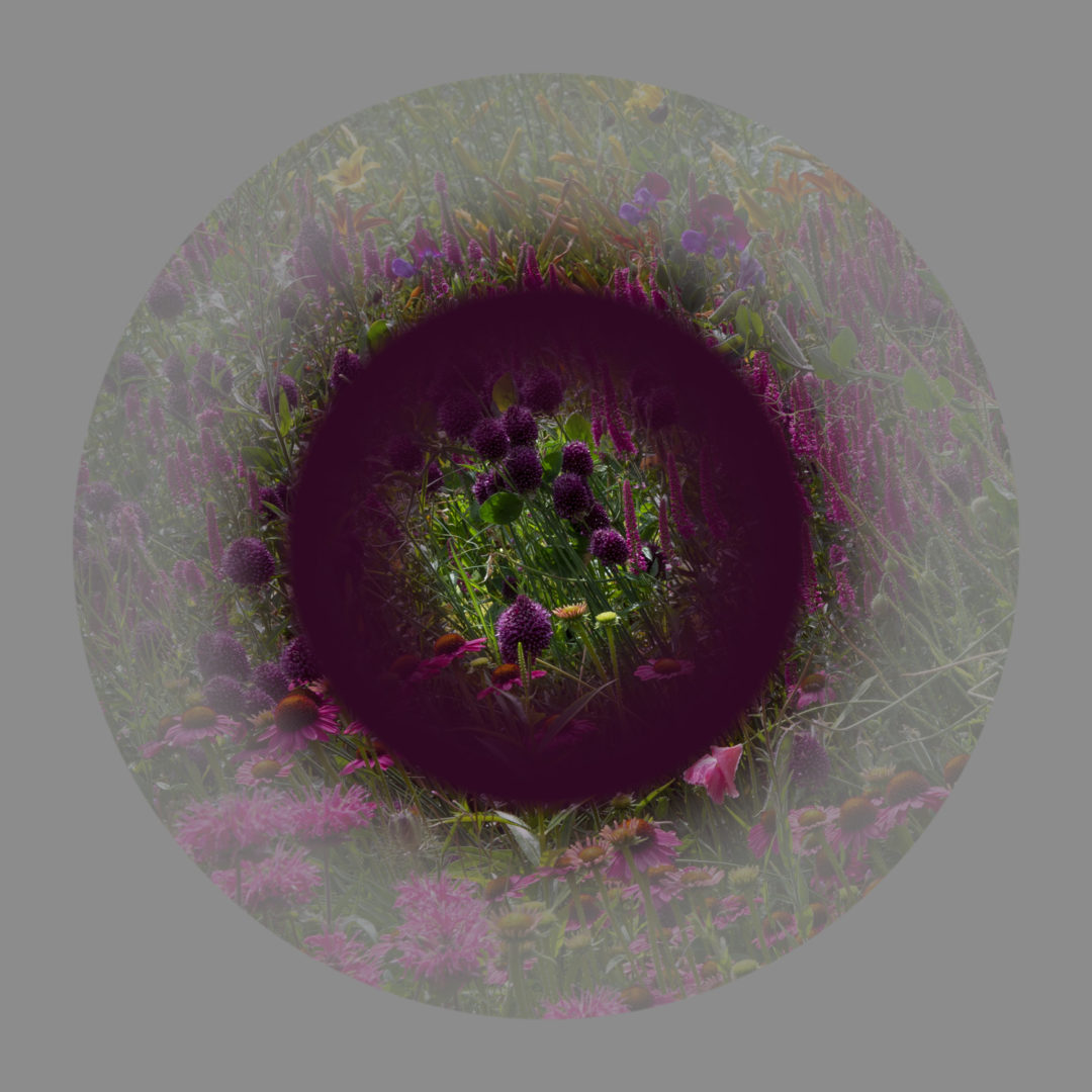
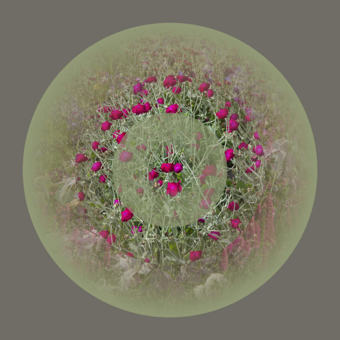
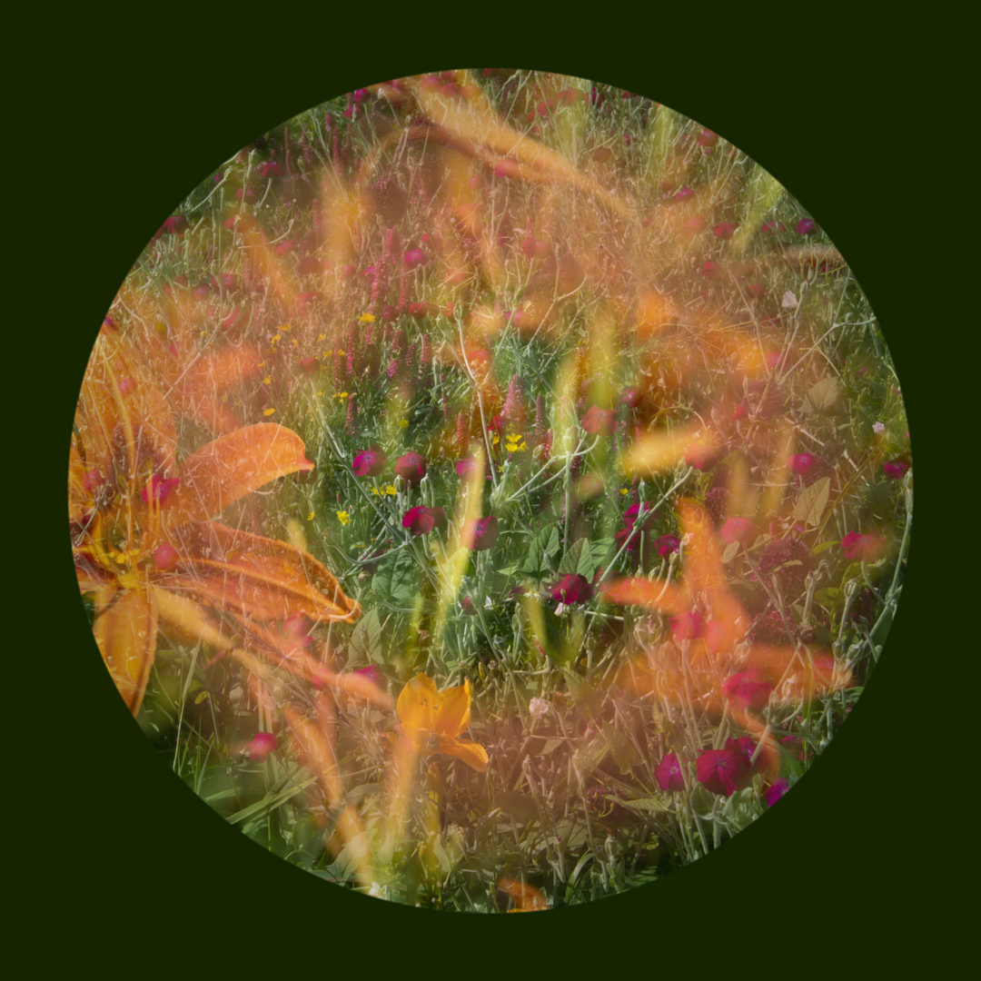
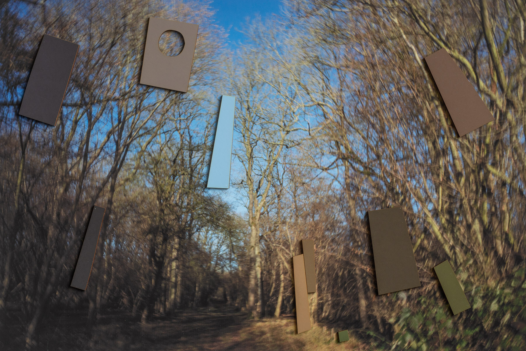
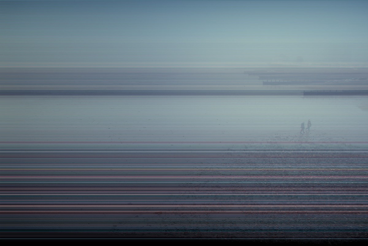
Radial Artworks
In recent years I started to make my own art. In this series, I photographed scenes of nature and added radial ‘colour amplifications’.
The coming-together of the natural and the man-made in these works leads to a shameless colour-fest. Maybe it also encourages people to look again at the beauty of the natural world, and to reflect on our troubled relationship with it.
I find that art is a great source of inspiration when designing brands. It helps me to make things which are beautiful and which engage people in an emotional way.
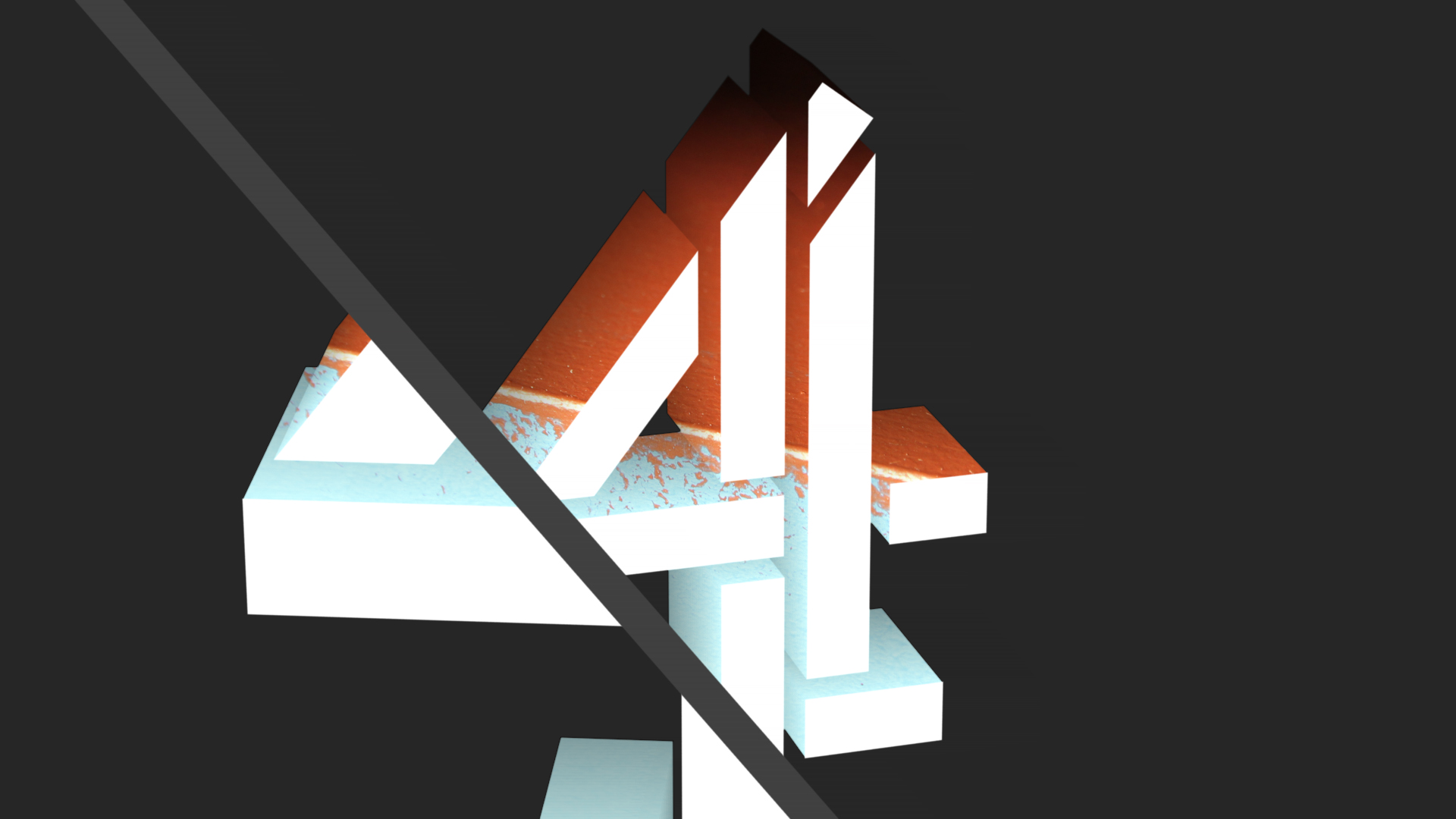
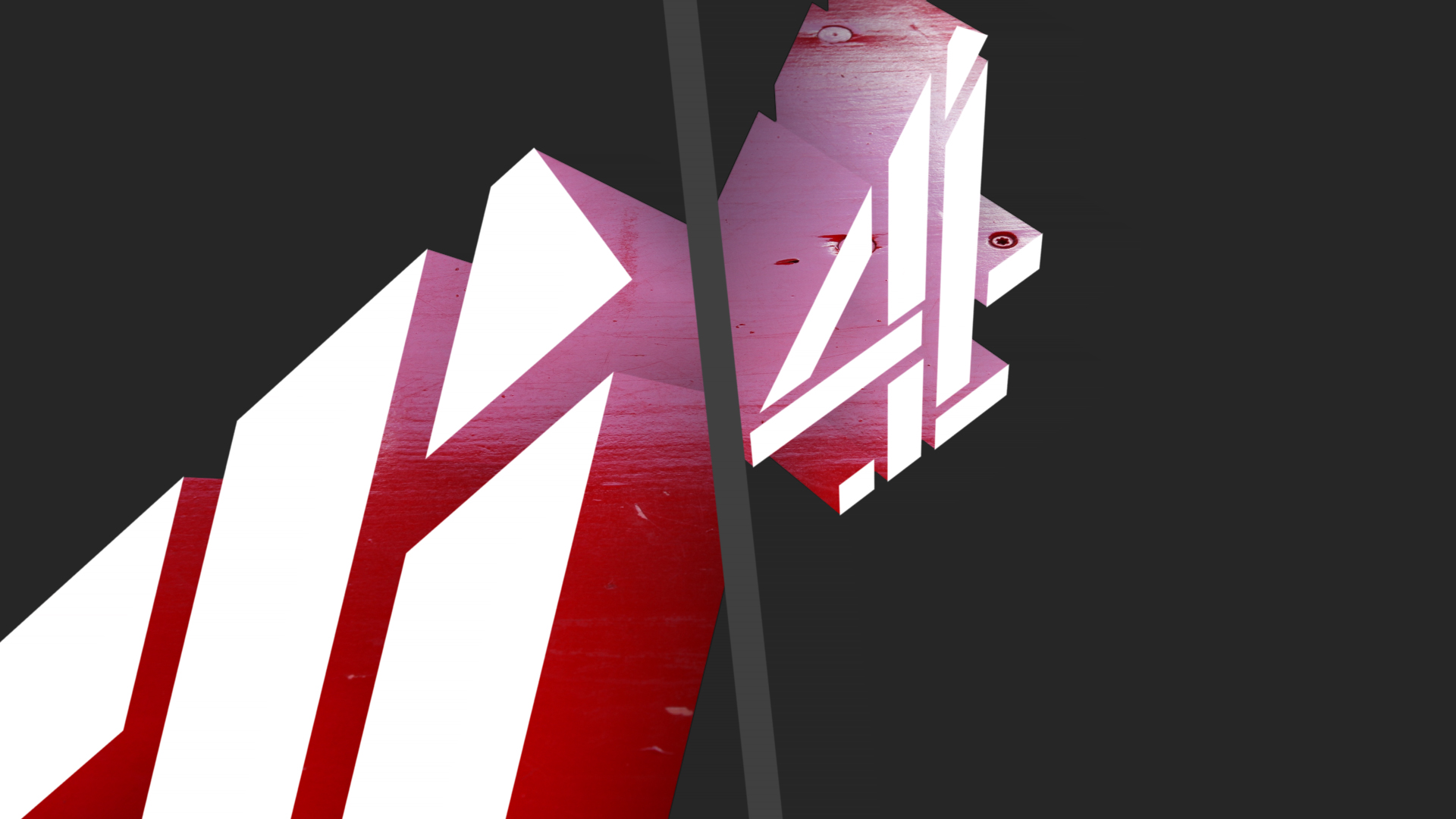
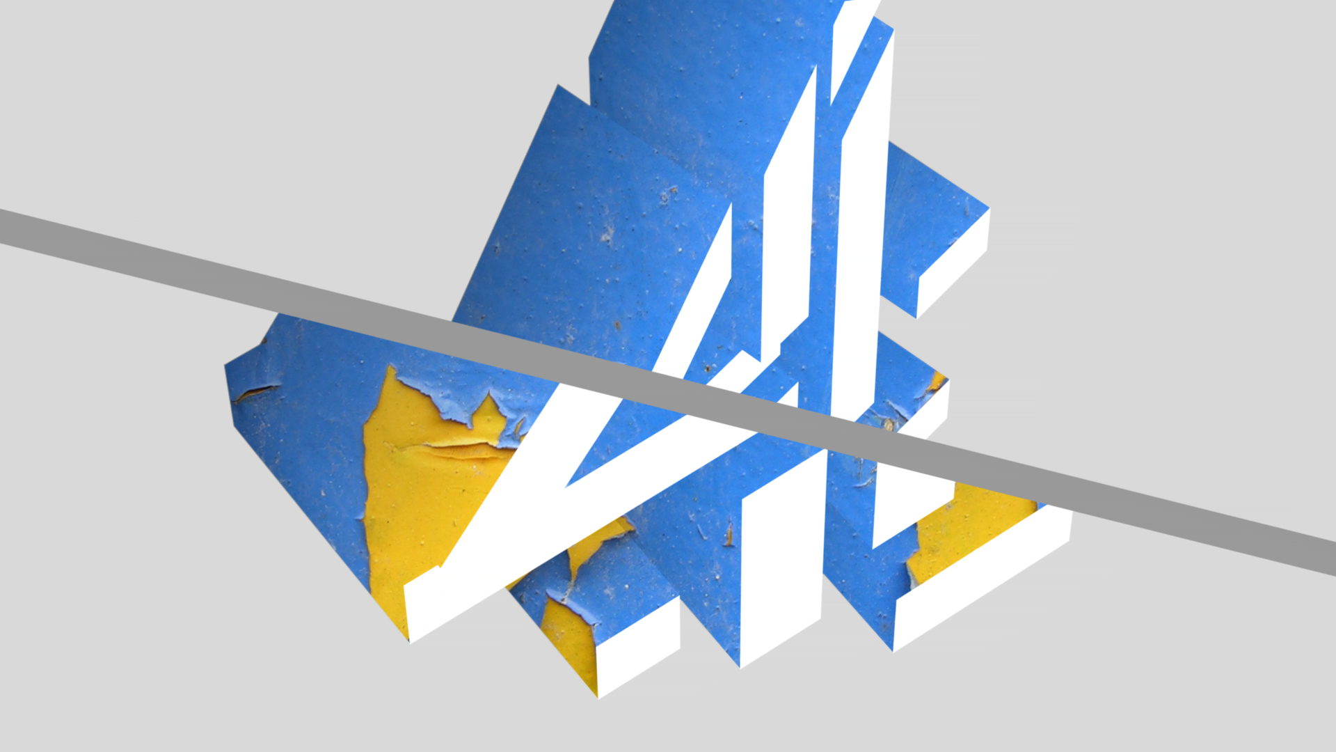
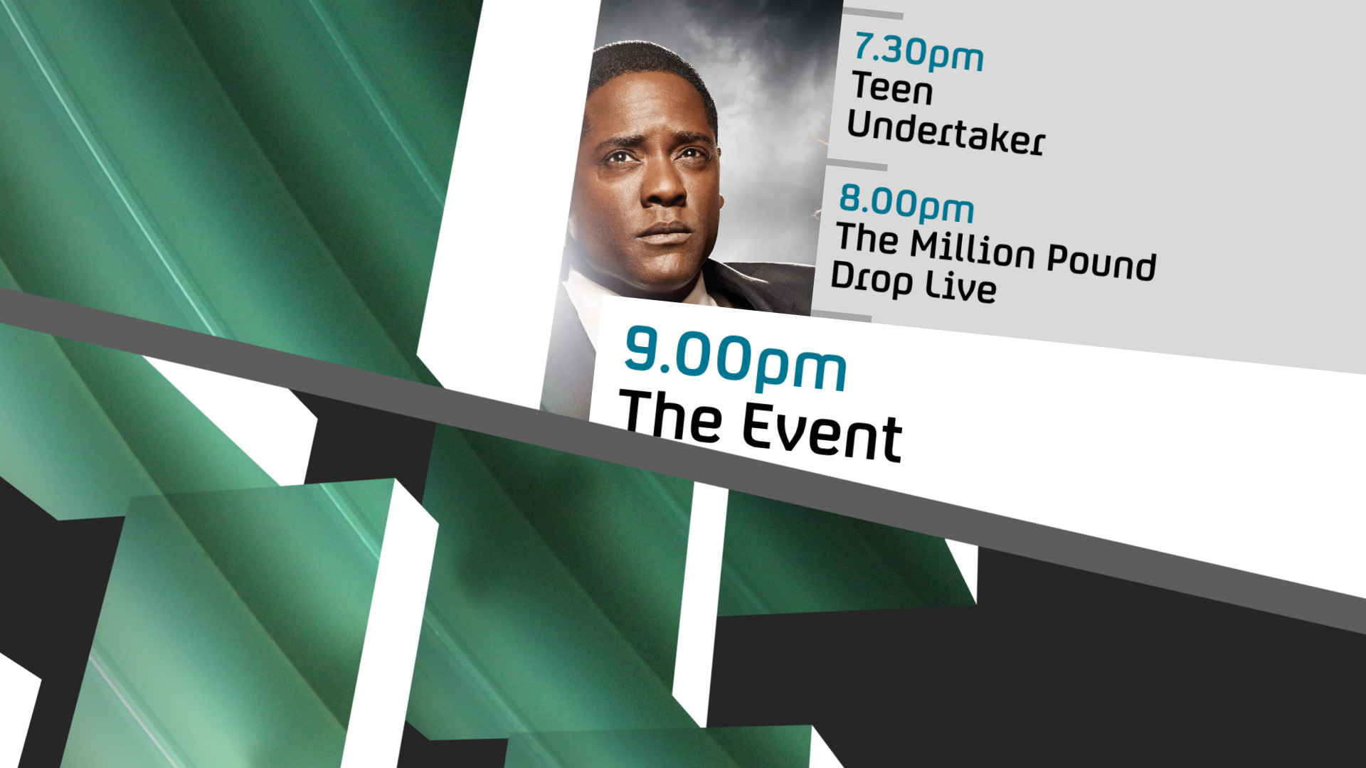
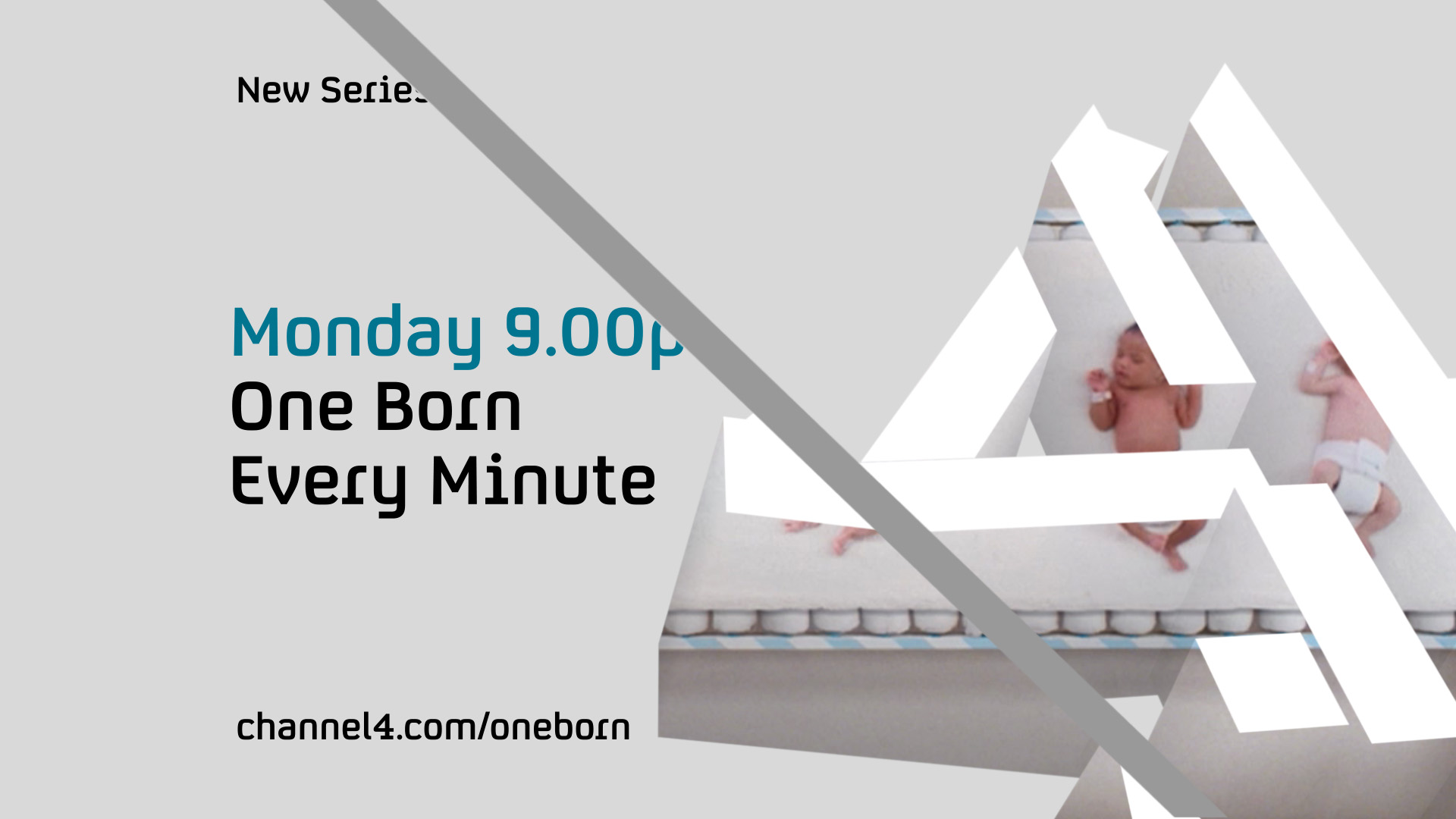
Channel 4 Identity 2010 to 2015
Channel 4 wanted us to re-think its on-screen branding, keeping its iconic logo centre-stage. My idea was to look at the logo from different angles, like the Cubists did a hundred years ago, and like Channel 4 do now.
I presented the idea with my own animations. I got the go-ahead and worked with my collaborators Oscar Gonzalez and Sylvie Minois to produce the final animations.
Of all the tools available to artists and designers, my favourite is colour. A particular palette speaks volumes instantly, without a single word.
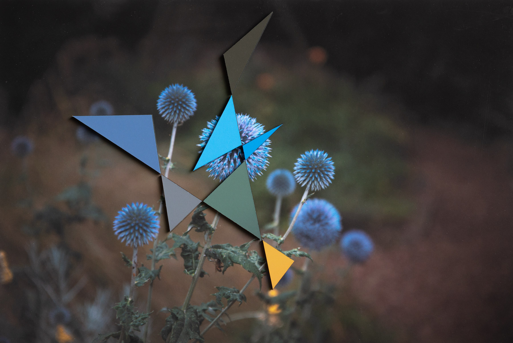
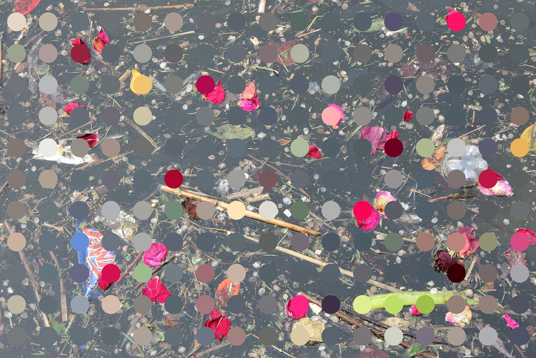
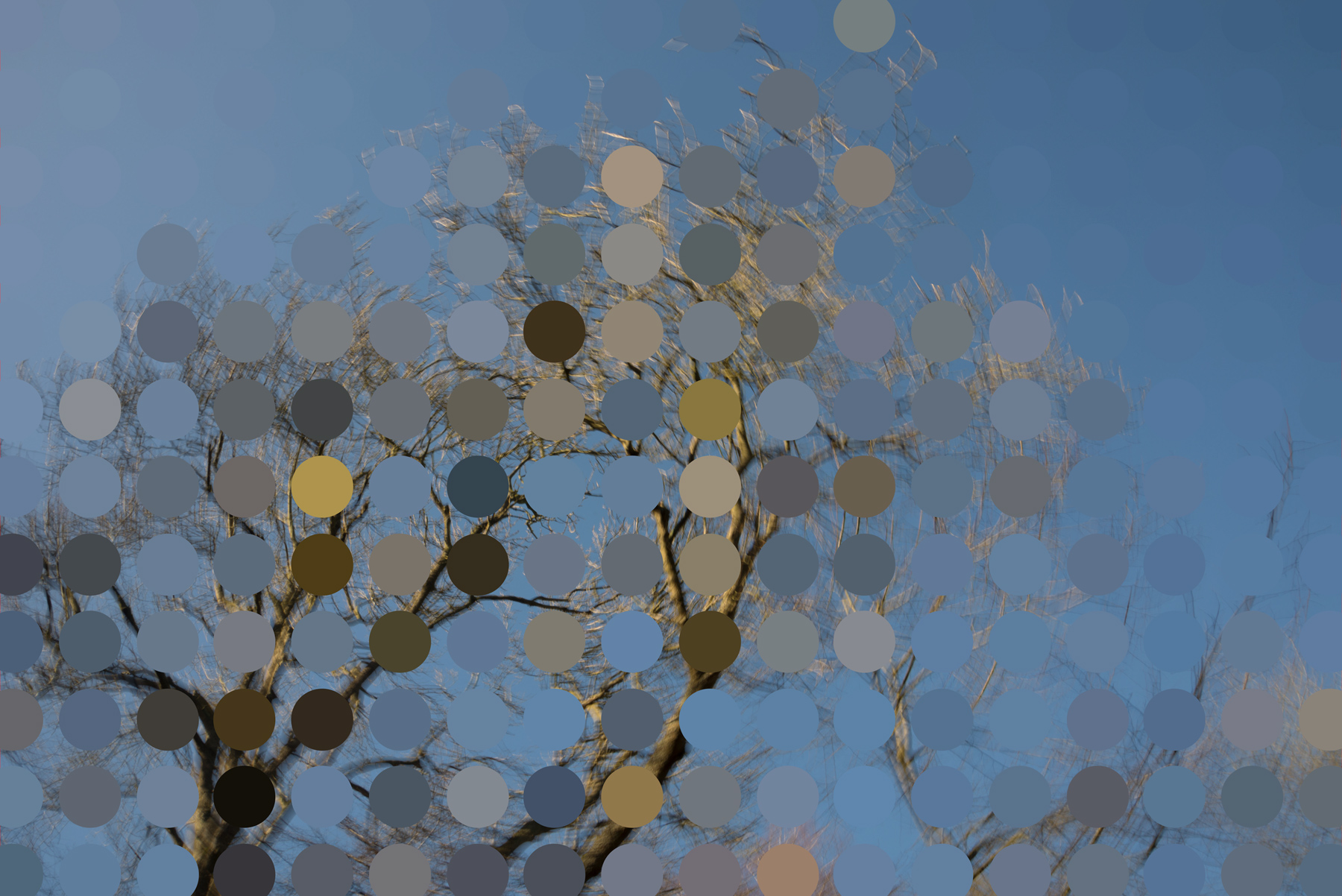
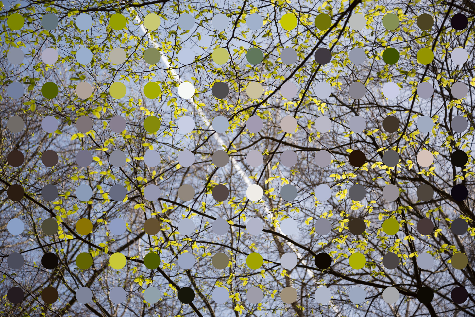
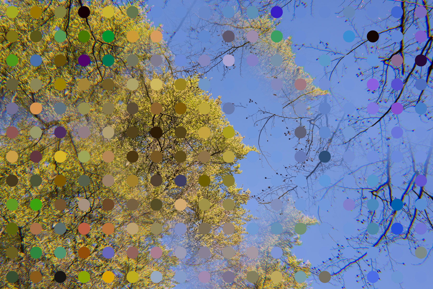
Artworks Which Colour-Pick like ITV
I was excited about the way that the colour-picking ITV logo behaved. I wanted to make artworks which used my photographs and mixed in colour-picking shapes and patterns. As I worked, I was thinking of the art of Bridget Riley, Gerhard Richter, Jackson Pollock and Ansel Adams.
My friend and collaborator Steve Jones created bespoke software which, with all sorts of adjustable parameters, could create large numbers of dots or lines, each one picking colour from the image.
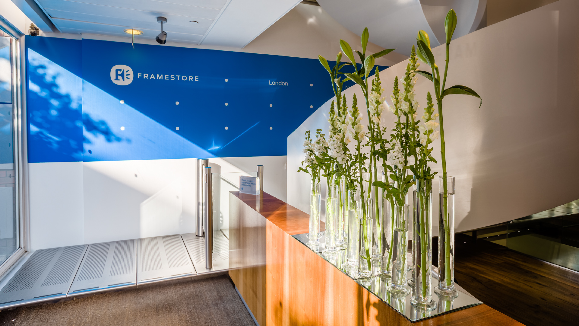
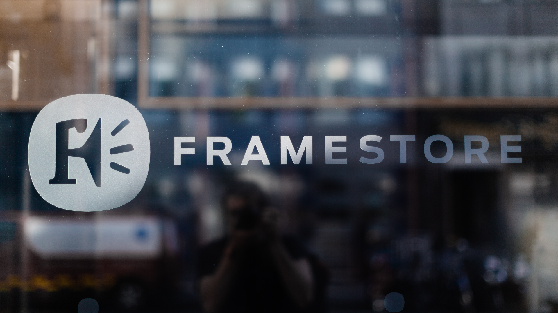
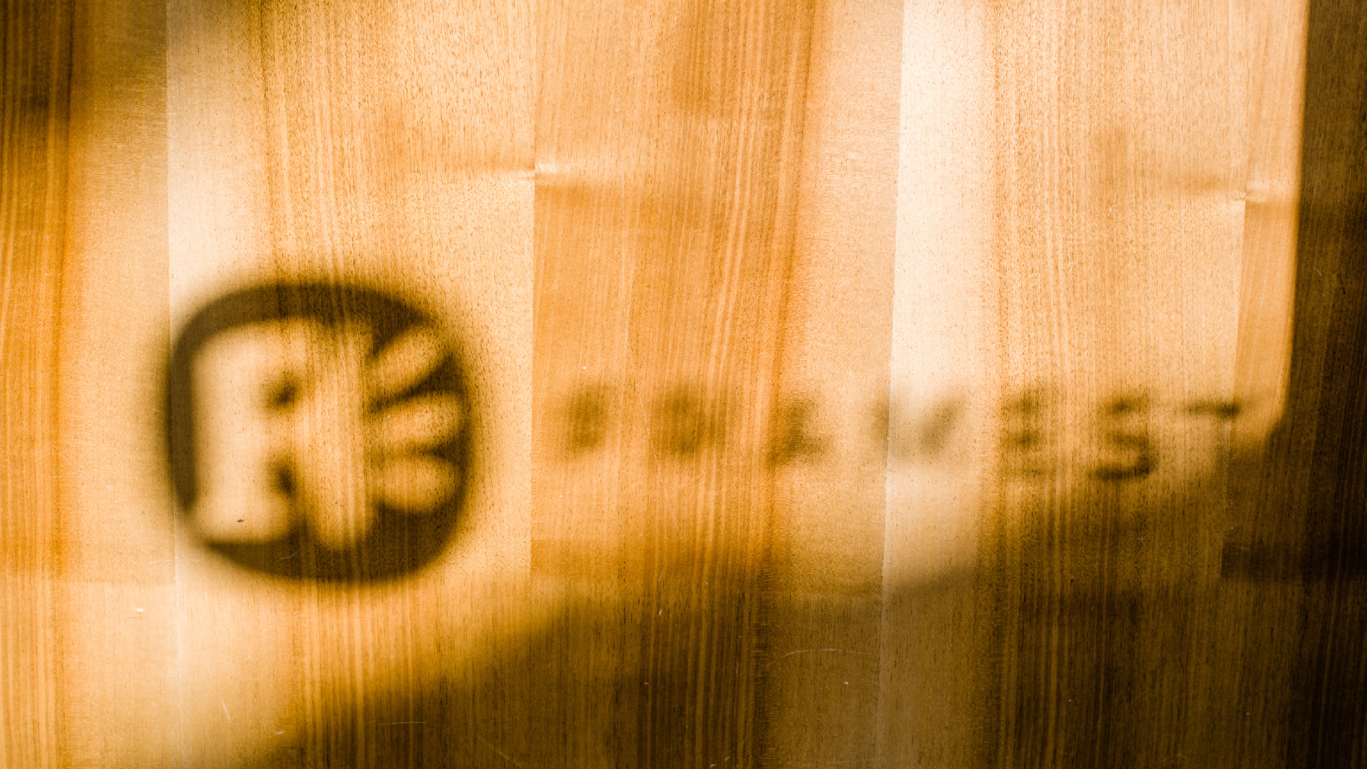
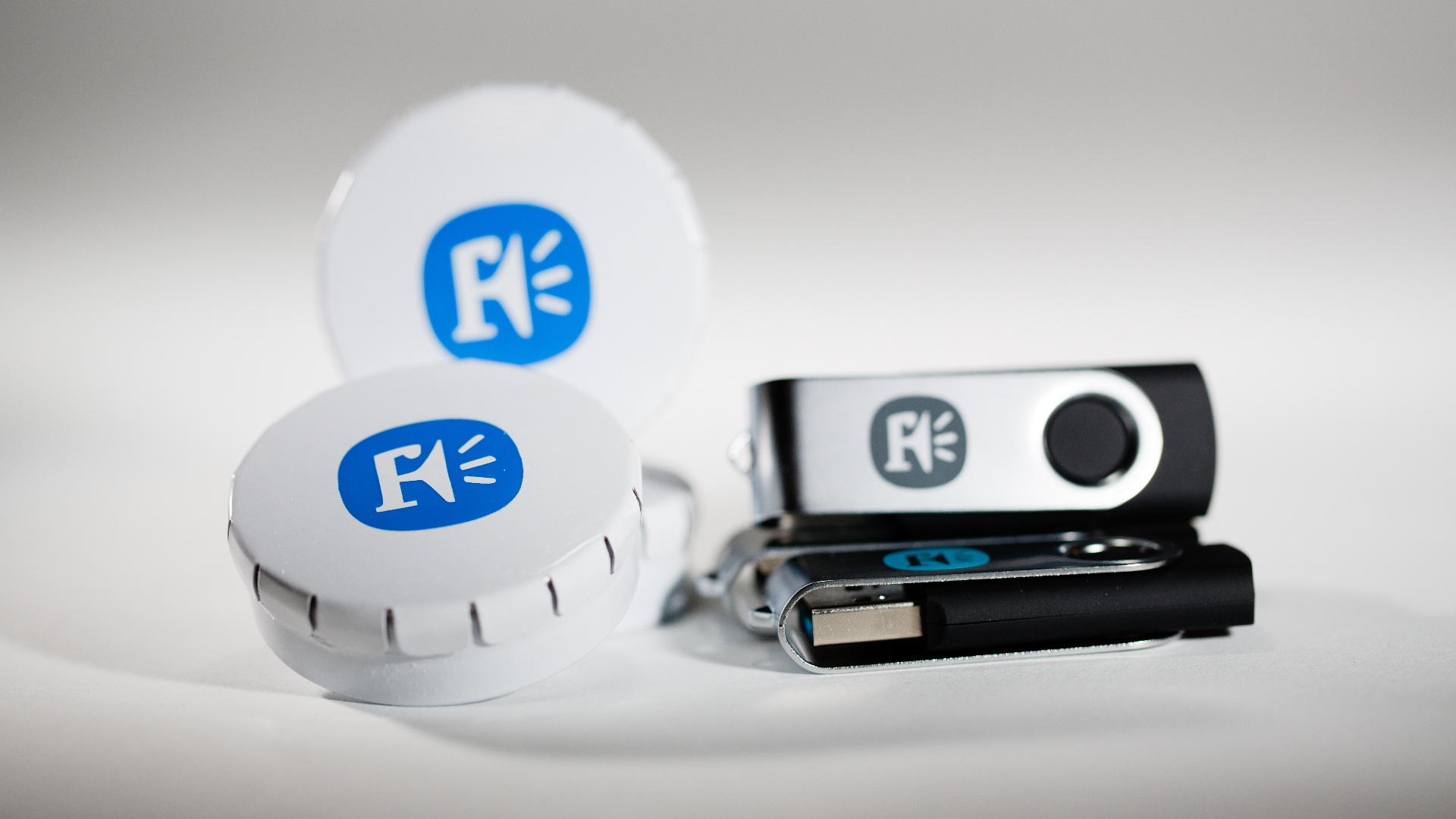
Framestore Rebrand
Framestore – a bunch of super-clever people working in film, advertising and content – wanted an evolution of their identity rather than a revolution. We worked with a light touch to conceptualise and deliver this brand design project in its entirety.
After a thorough and collaborative process where we explored the right amount of transformation, we created a full range of print materials, signage, merchandise, and a comprehensive style guide.
A keen awareness of budget and schedule leads to the best possible outcomes. Let’s come up with an idea that makes the best of the money and time available.
Red Arrow Studios Identity
This global entertainment group wanted something authoritative and yet fun for their new identity. We came up with this ‘slinky’ concept.
After a thorough and collaborative process to develop the idea, we delivered a full range of print materials, logo animations, an extensive website and a comprehensive style guide.
A good idea will go unnoticed if executed poorly. I like to craft work to the highest standard by collaborating with a circle of friends who are designers, illustrators, animators, musicians, type designers and coders.
Hera Pictures Logo
Liza Marshall called her new production company Hera after the Greek goddess, and I came up with this logo to communicate strength, independence and femininity.
I worked largely on my own on this project, but in the model of the ITV logo design process, my friends at type foundry Fontsmith crafted the final drawing of the logo.
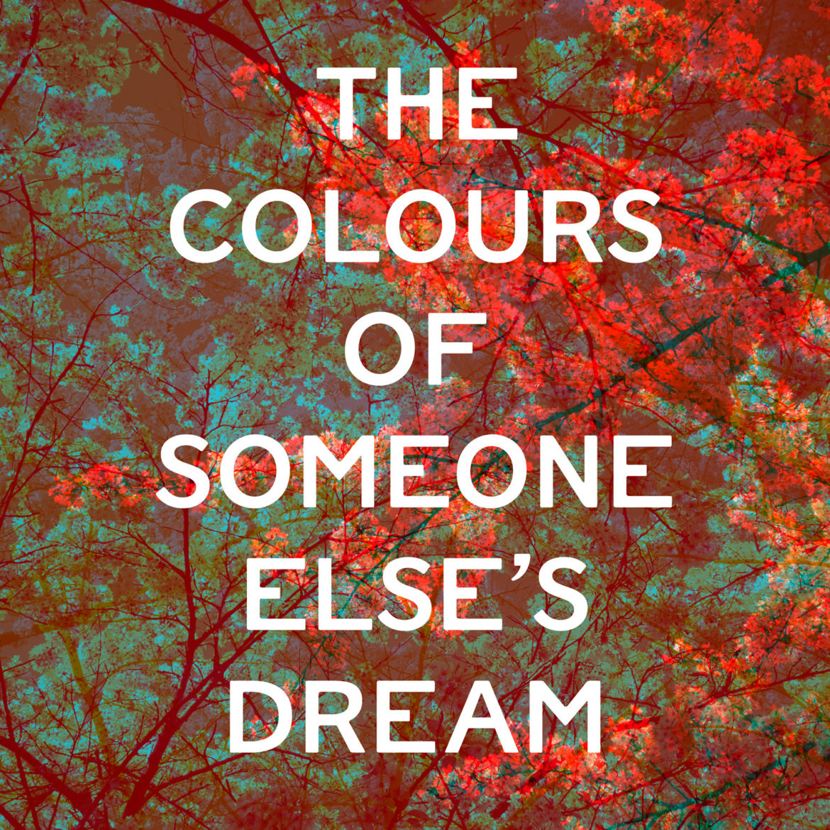
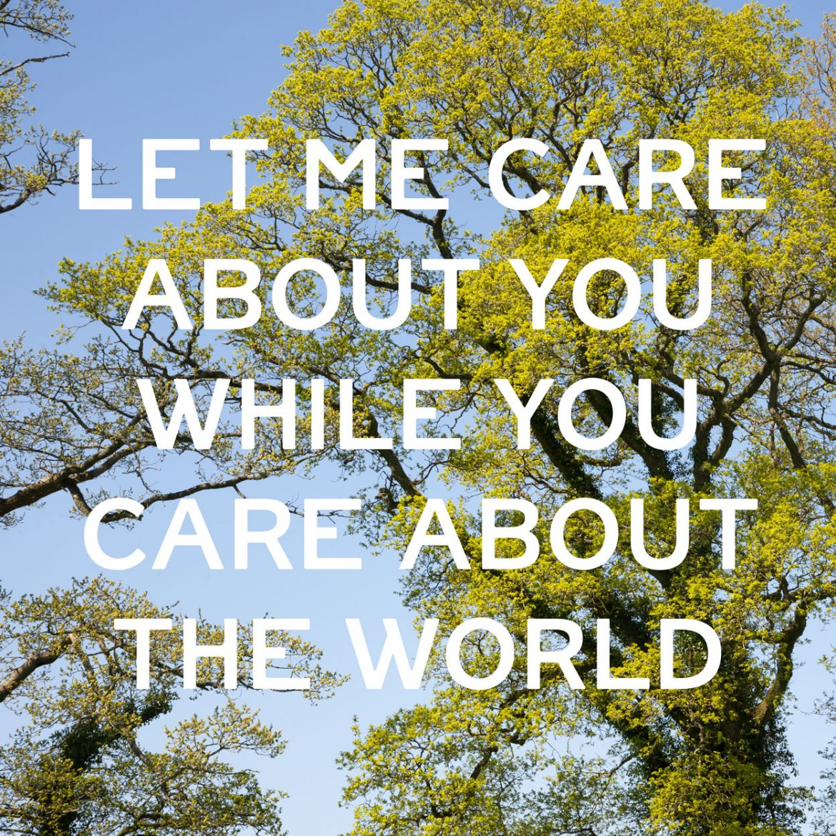
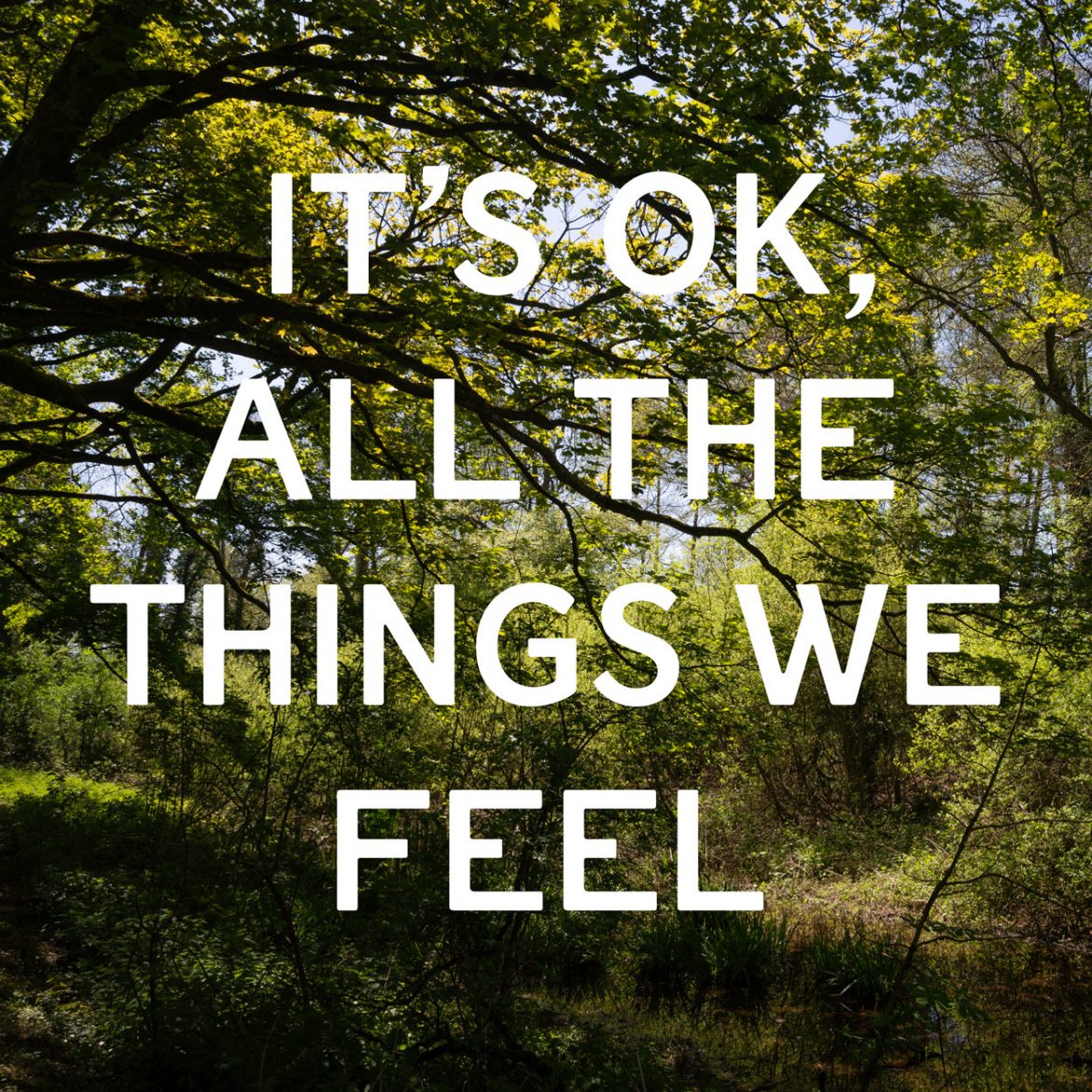
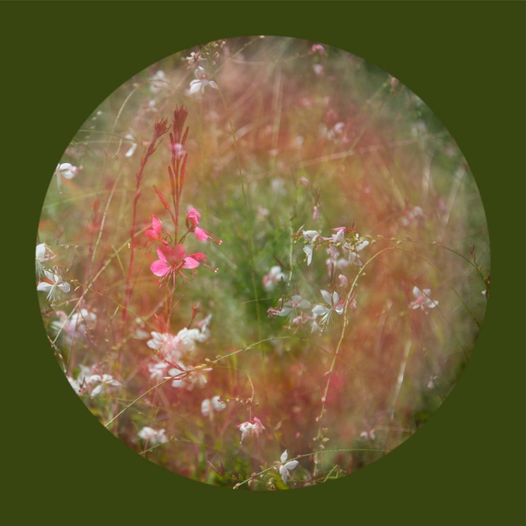
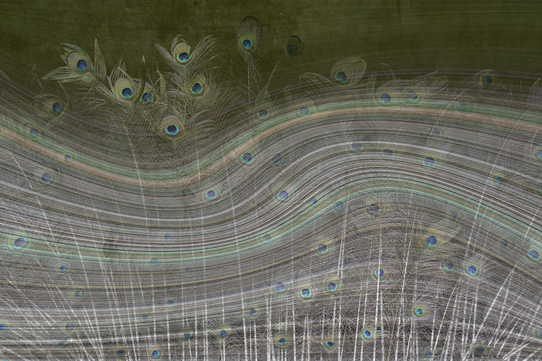
Artworks With Words
Some people want art to move them in an intellectual way and others are more concerned with aesthetics and beauty. I wanted these artworks to work in both ways. The photographs of nature are all about beauty, whilst I hope the words, which are moments from songs I have written, provoke curiosity. What do these words mean? What is the relationship between the words and the images?
Interesting side note – the typeface is FS St James, which is part of the Fontsmith’s Lost and Foundry project, where typography found in London’s Soho was lovingly crafted into digital fonts.
You can read more about how I work on the About page. If you’d like to get in touch, drop me a line.