A clean slate
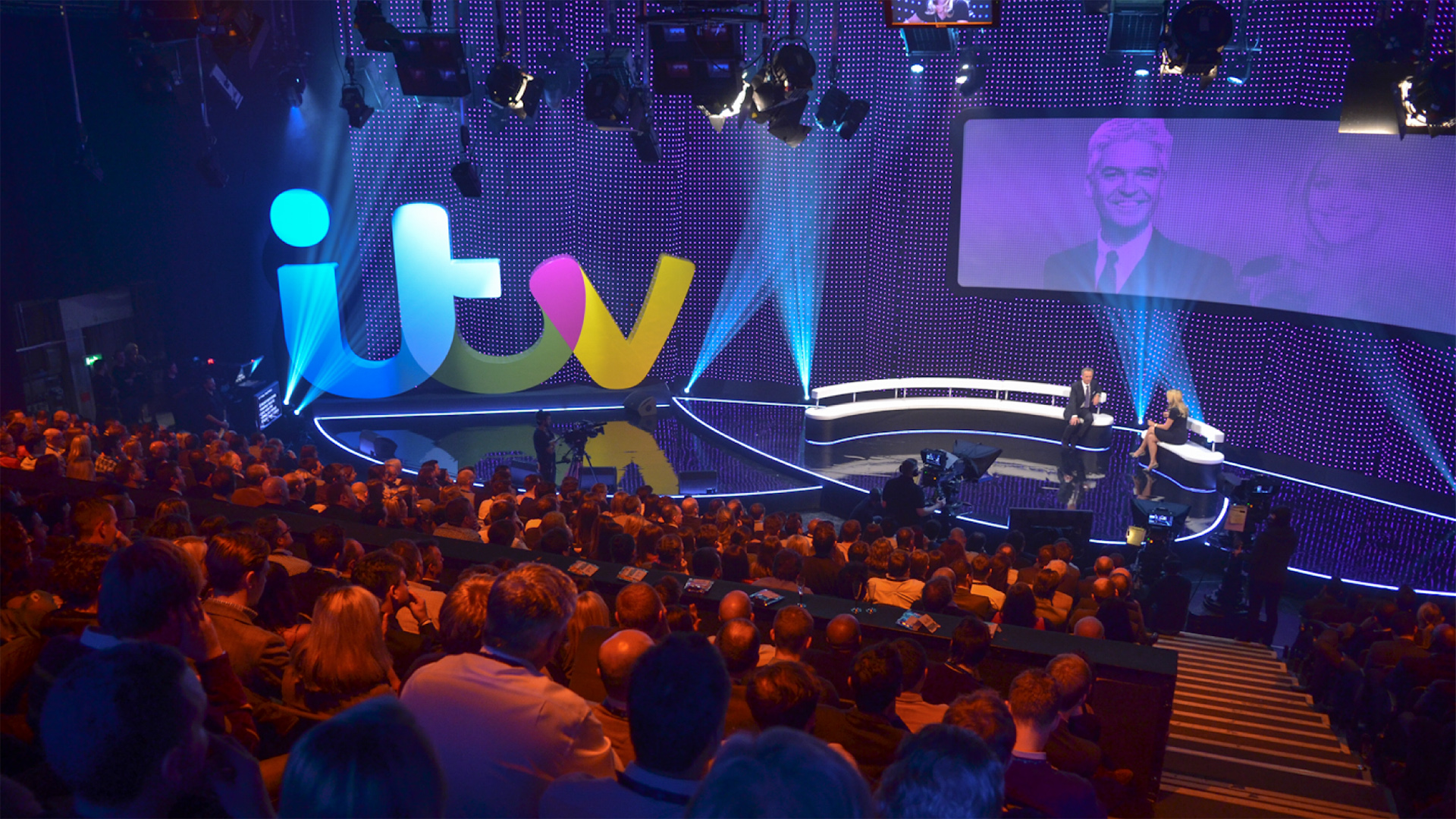
In early 2012, the UK television network ITV wanted to start again with its brand. A new logo was required, along with a complete brand identity to span five TV channels and a host of off-air and digital environments. Rudd Studio won the pitch to undertake the rebrand, working in partnership with ITV’s in-house creative team. Matt Rudd was to lead a pop-up studio to house the new team.
Strategic thinking
We couldn’t start designing logos before considering ITV’s place in the UK – what distinguished it from other broadcasters? We saw that it provided hugely popular content that brought all sorts of people together. A good summary was to say that ITV was at the heart of popular culture in the UK.

Developing the logo
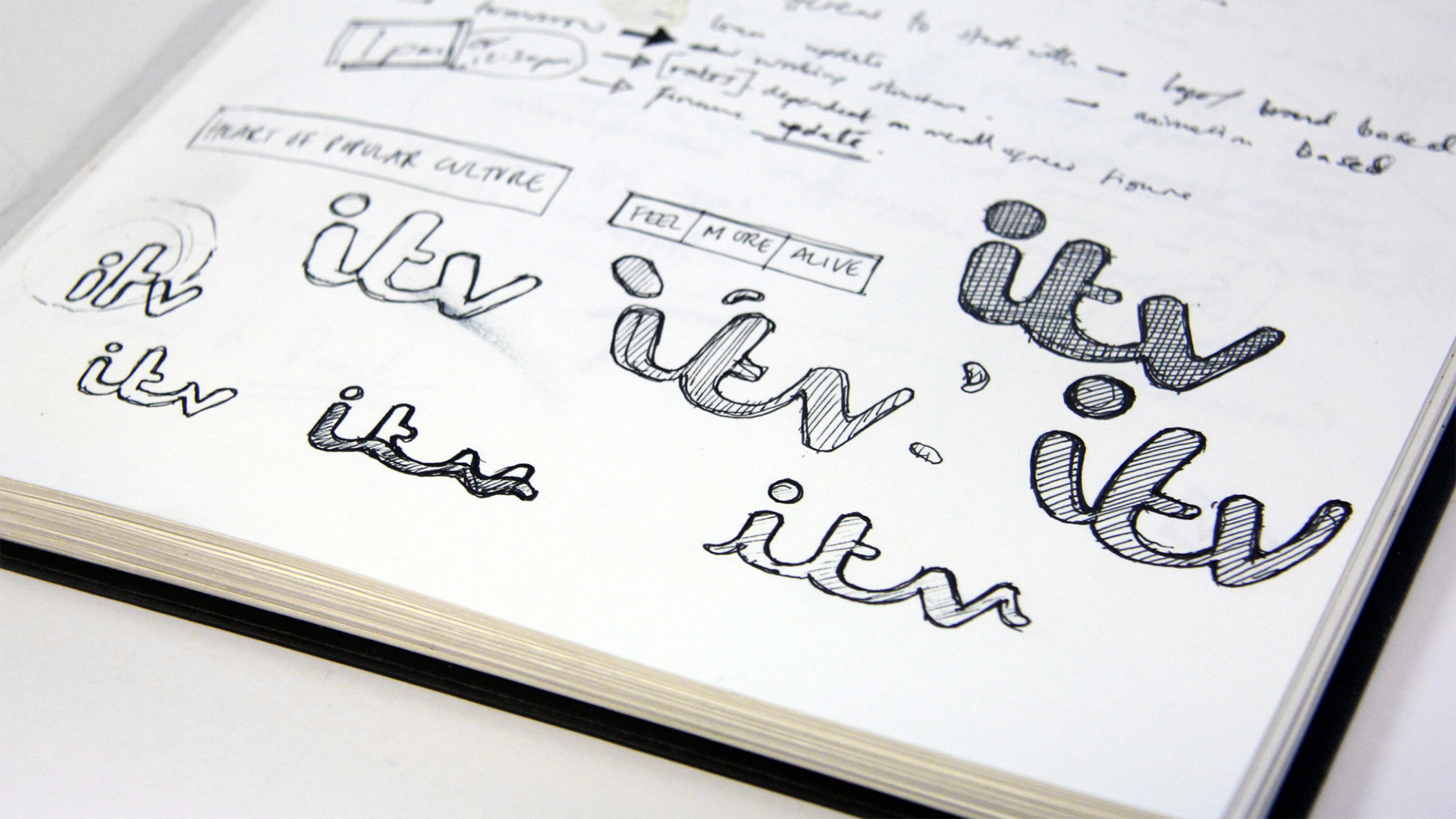
We now had a starting point for the logo design process. Matt Rudd explored a marque based on handwriting. Alongside the serious BBC logo and the challenging Channel 4 logo, this felt friendly and human. Read the blog post The Story of the New ITV Logo.
Colour-picking
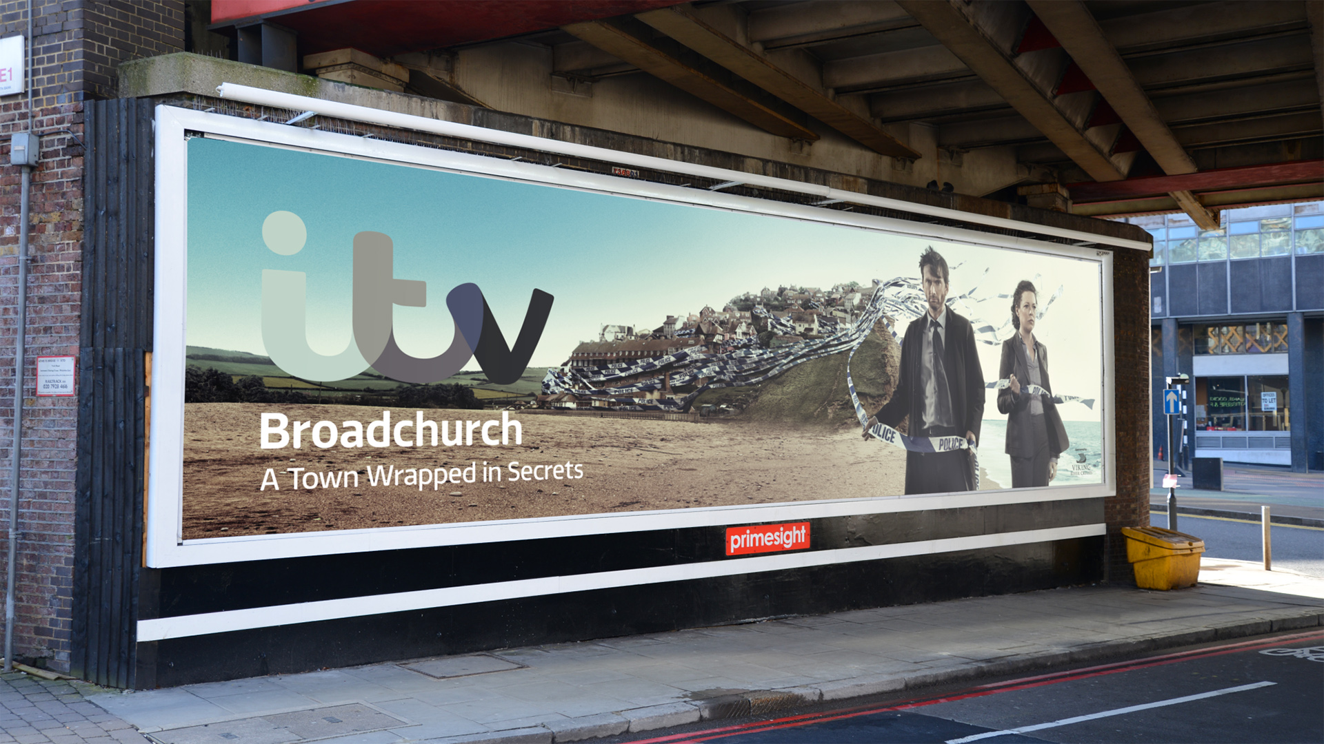
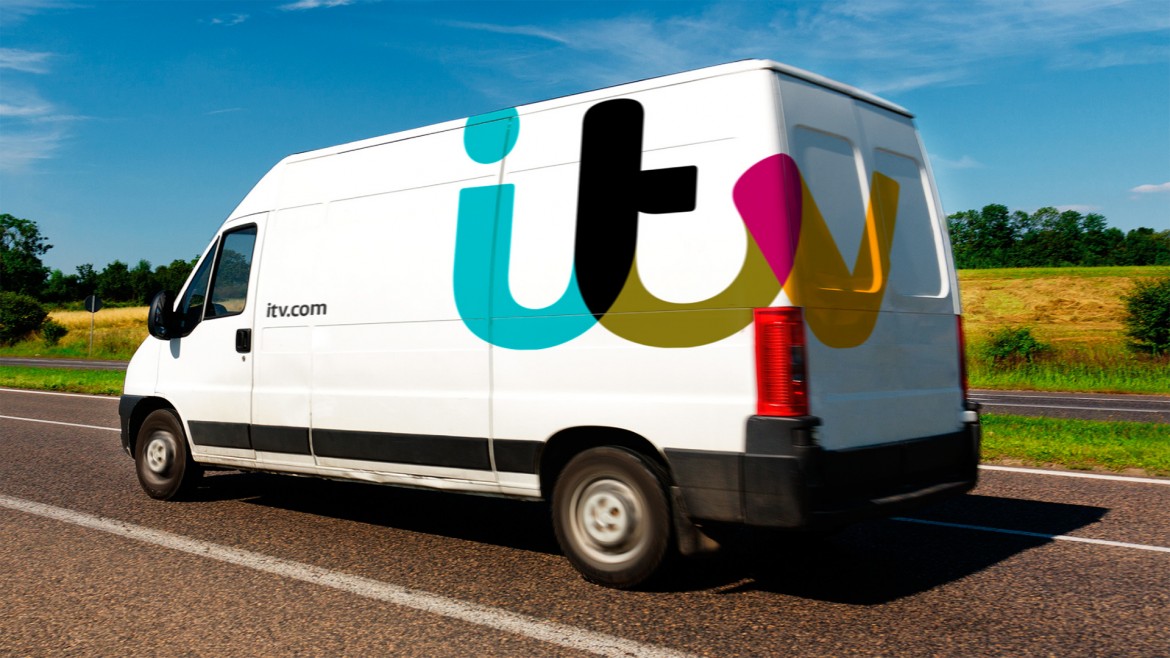
Our brief was to create a brand which proudly held the network’s content, and showed ITV as a positive part of people’s lives. Therefore we wanted the new logo to fuse with imagery rather than ‘badge’ it. Matt developed the final logo design and its ‘colour-picking’ behaviour with this in mind. ‘Colour-picking’ means that five parts of the logo take colours from their environment. The logo becomes an intriguing and enjoyable addition to the imagery. The ‘colour-picked’ logo is used on ITV promos and idents, so that these key parts of the channel do not become repetitive. The mechanism requires little post-production and many idents can be made, creating variety and the opportunity to reflect events or seasons.
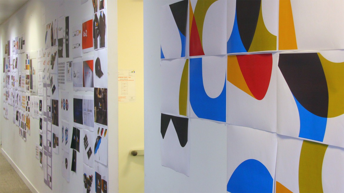
The Channel Family
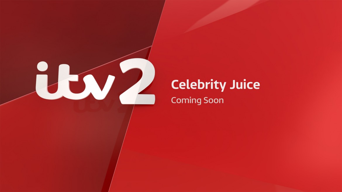
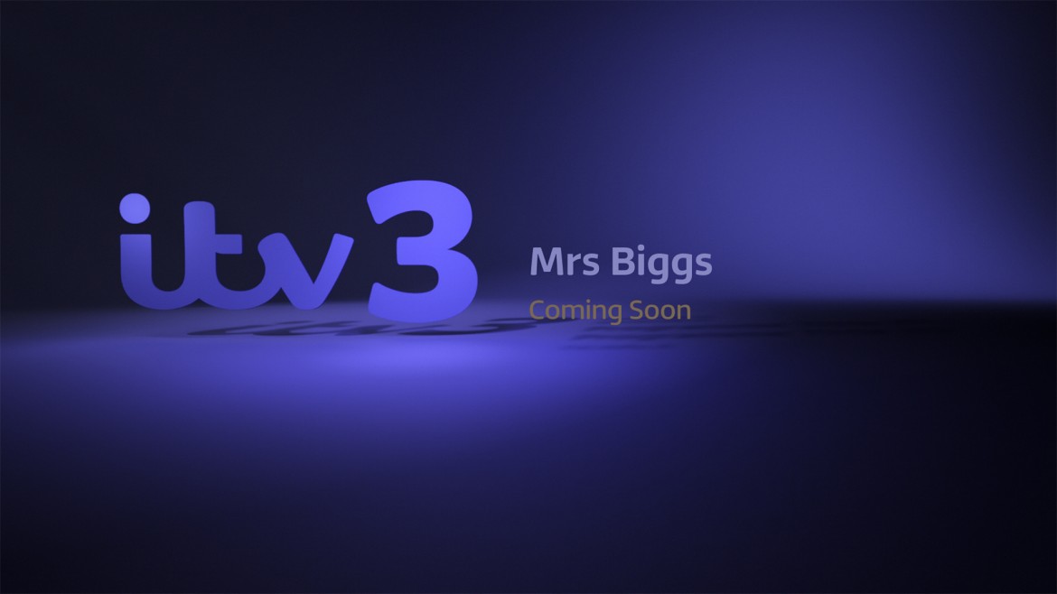
We wanted the suite of ITV channels to look interlinked yet distinctive. The channel logos all sit in the same position and the dot of the ITV logo becomes a device for seamless transitions between elements on a single channel, or from one channel to another.
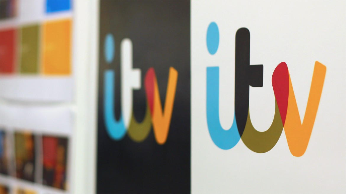
Hero colours
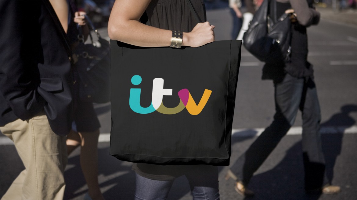
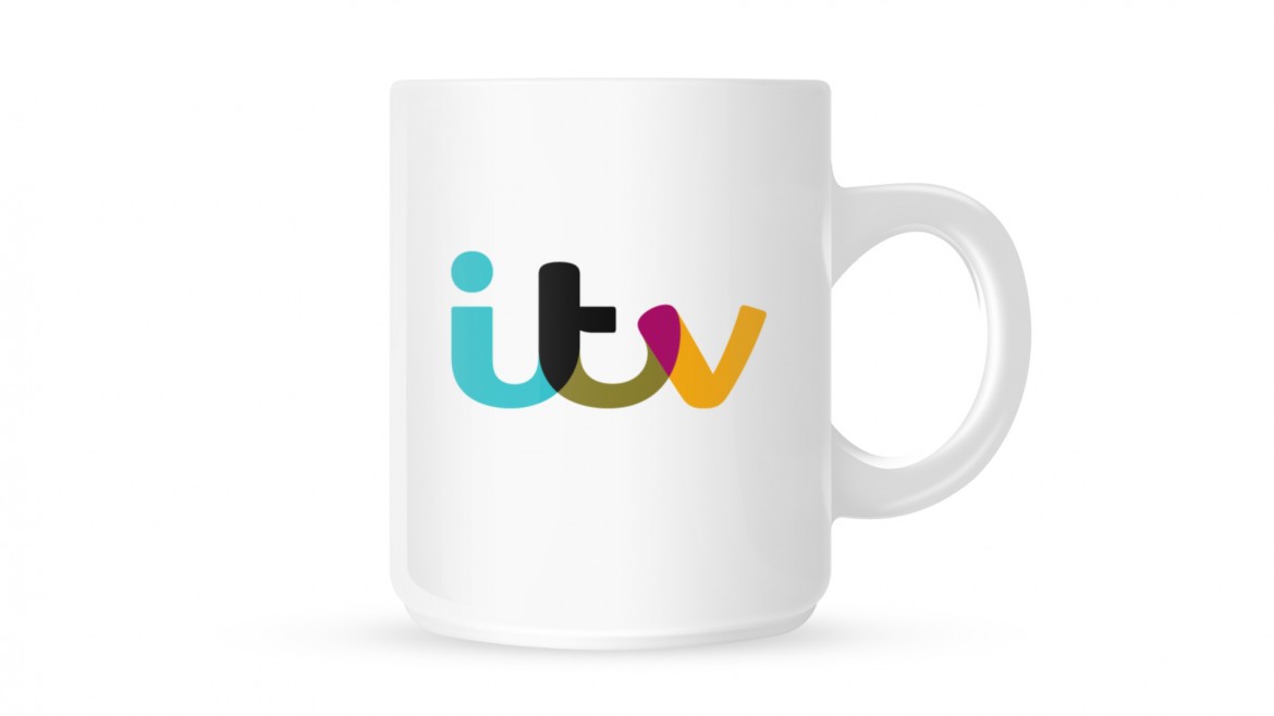
We picked a set of ‘hero’ colours for the logo. They span the colour spectrum, suggesting the network’s wide range of content. They are lively and joyful, speaking of an organisation at ‘the heart of popular culture in the UK’. At the same time, they are appropriate for a serious corporation like ITV. The logo is designed to work in its ‘hero’ colours on either a white or black background. There is a warmth to the handwriting-inspired logo which means that it doesn’t shout even when it is big.
The typeface
We worked with London type designers Fontsmith on a new typeface for ITV. We took cues from the logo, combining straight and round terminals. The typeface has a clear personality and yet works in diverse settings which range from ITV News to The Only Way Is Essex.

A positive outcome
Rudd Studio and ITV believed that the brand could feel both mainstream and high quality. This shared vision led to a fresh, contemporary brand, which would encourage people to continue enjoying the content they had always loved, and at the same time consider ITV itself in a positive new light. The new identity has led to many awards, including a Gold Promax Award for best Channel Identity, a Design Week Award for Brand of the Year and a Media Week Award for Media Brand of the Year.