Skip to content
The TG4 logo in its new environment

The background

TG4, which began life in 1996 and was originally known as TnaG, was the third national television station to be launched in Ireland. Every day there are 7 hours of programmes in Irish. In early 2012, we started talking with the channel about updating their brand. Matt Rudd travelled to Galway to meet Creative Director Seán Cathal Ó Coileáin and to learn about TG4 and its role in the country. Matt hit it off with Seán Cathal, who he found to be passionate about his work at TG4, and about the channel’s role in protecting and promoting the Irish language.

A different view

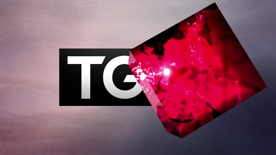
TG4’s strapline – Súil Eile, ‘a different view’ – is a good summary of the channel’s attitude. Working with creative studio Pete&Tom, we developed ‘a different view’ within the logo, showing a magical, enchanted world. This intriguing environment contains Celtic symbols and suggests history and story telling. The colours and clean lines outside the logo speak of the modern Ireland of today and tomorrow.

The cube and the typeface

The glowing logo cube performs different functions, all the time helping to maintain the channel’s distinctive atmosphere. Special stings are made for seasonal events. On St Patrick’s Day the logo cube turns green. Over Christmas it is red. A bespoke typeface, designed by Fontsmith, nods at Gaelic letterforms whilst feeling completely contemporary.

We don't collect your data, and we only use cookies essential to run this website. There are third-party cookies used by Vimeo video players in the site, which are used for statistics purposes. By continuing to use this site, you consent to our use of cookies as detailed in our privacy policy.